19 - Styling
接下来的内容就是styling相关的。
react native里面的样式写法和web端的写法有类似,也有区别。
1、react native里面不写CSS相关代码,而是在js里面写样式。
2、样式的名称采用小驼峰的写法,比如说在web端我们这样写background-color,而在react native里面写成backgroundColor。
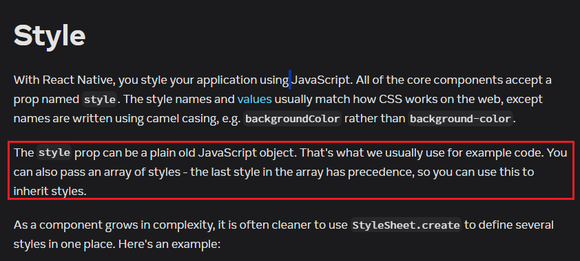
在react native中有两种写样式的方法,第一种方式是写内联样式,直接在标签上定义style属性。第二种方式是使用react native提供的StyleSheet API,我们经常使用StyleSheet.create方法来编写样式。
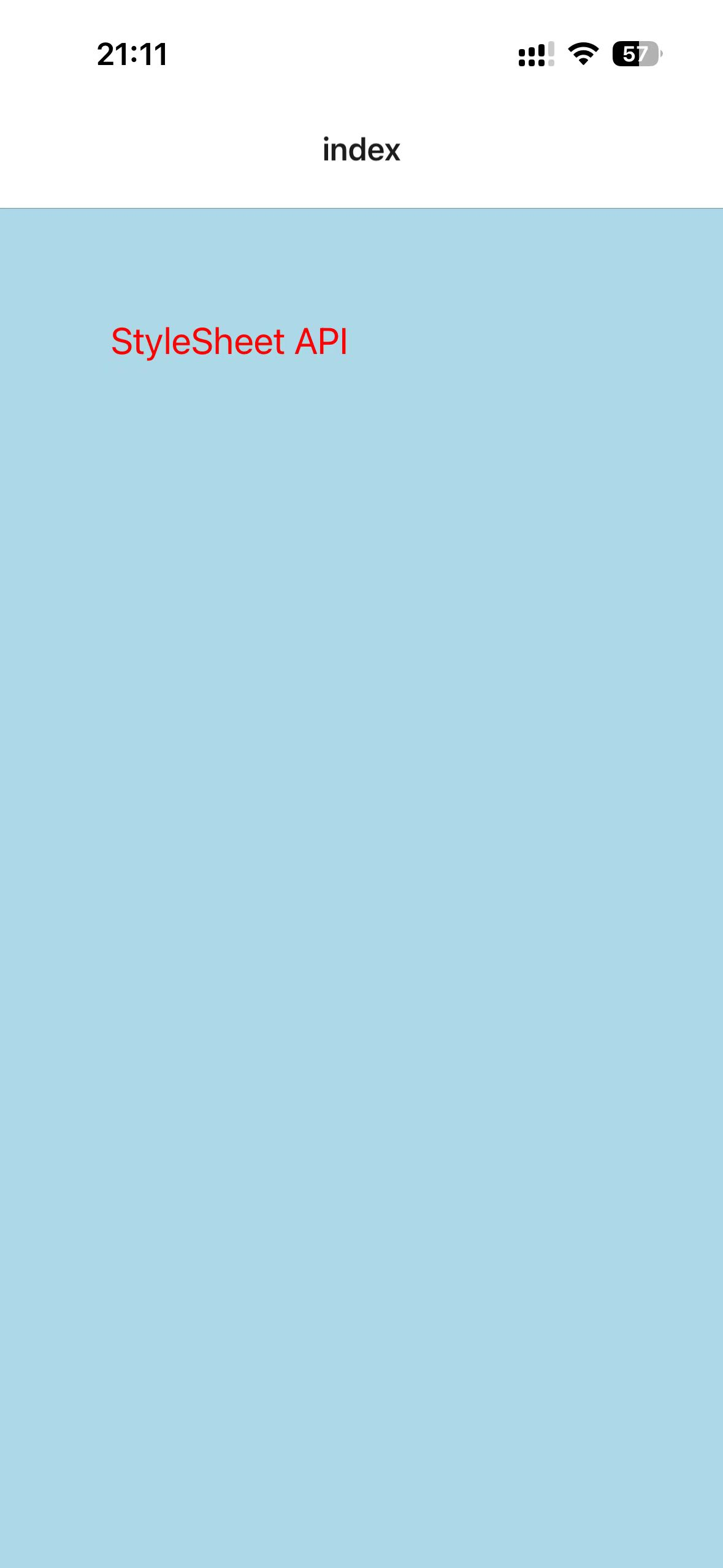
20 - StyleSheet API
xxxxxxxxxx191// app/index.tsx23import { View, Text, StyleSheet } from 'react-native'45export default function Index() {6 return <View style={styles.container}>7 <Text style={styles.title}>StyleSheet API</Text>8 </View>9}1011const styles = StyleSheet.create({12 container: {13 flex: 1, backgroundColor: "lightblue", padding: 6014 },15 title: {16 fontSize: 20,17 color: "red"18 }19})效果:
一般来说,每一个组件里面的styles都定义在自己的组件里面,但是有一些通用的styles,可以使用export暴露出去,让全局都可以使用。
21 - Multiple Styles
https://reactnative.dev/docs/style
这一节课主要讲解如何为组件设置多种样式,什么意思呢?
我们从上面学习到,可以为组件这样设置样式<View style={styles.container}></View>,但是样式肯定是有一些重复的部分,这些部分就可以设置成单独的对象名,那么怎么在style属性里面设置多个样式对象呢?这节课就是讨论这个问题。
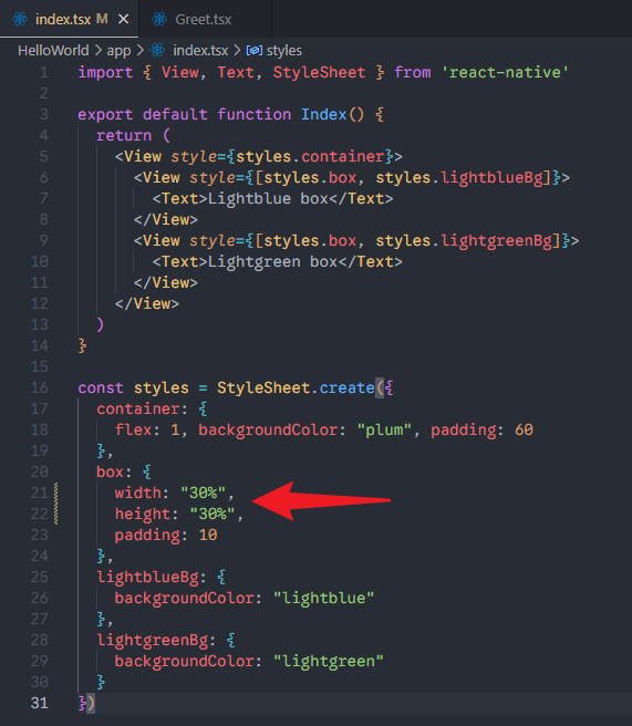
解决办法就是指定style属性的值为数组,像这样子:<View style={[styles.container, styles.box]}></View>。
xxxxxxxxxx331// app/index.tsx23import { View, Text, StyleSheet } from 'react-native'45export default function Index() {6 return (7 <View style={styles.container}>8 <View style={[styles.box, styles.lightblueBg]}>9 <Text>Lightblue box</Text>10 </View>11 <View style={[styles.box, styles.lightgreenBg]}>12 <Text>Lightgreen box</Text>13 </View>14 </View>15 )16}1718const styles = StyleSheet.create({19 container: {20 flex: 1, backgroundColor: "plum", padding: 6021 },22 box: {23 width: 100,24 height: 100,25 padding: 1026 },27 lightblueBg: {28 backgroundColor: "lightblue"29 },30 lightgreenBg: {31 backgroundColor: "lightgreen"32 }33})效果:
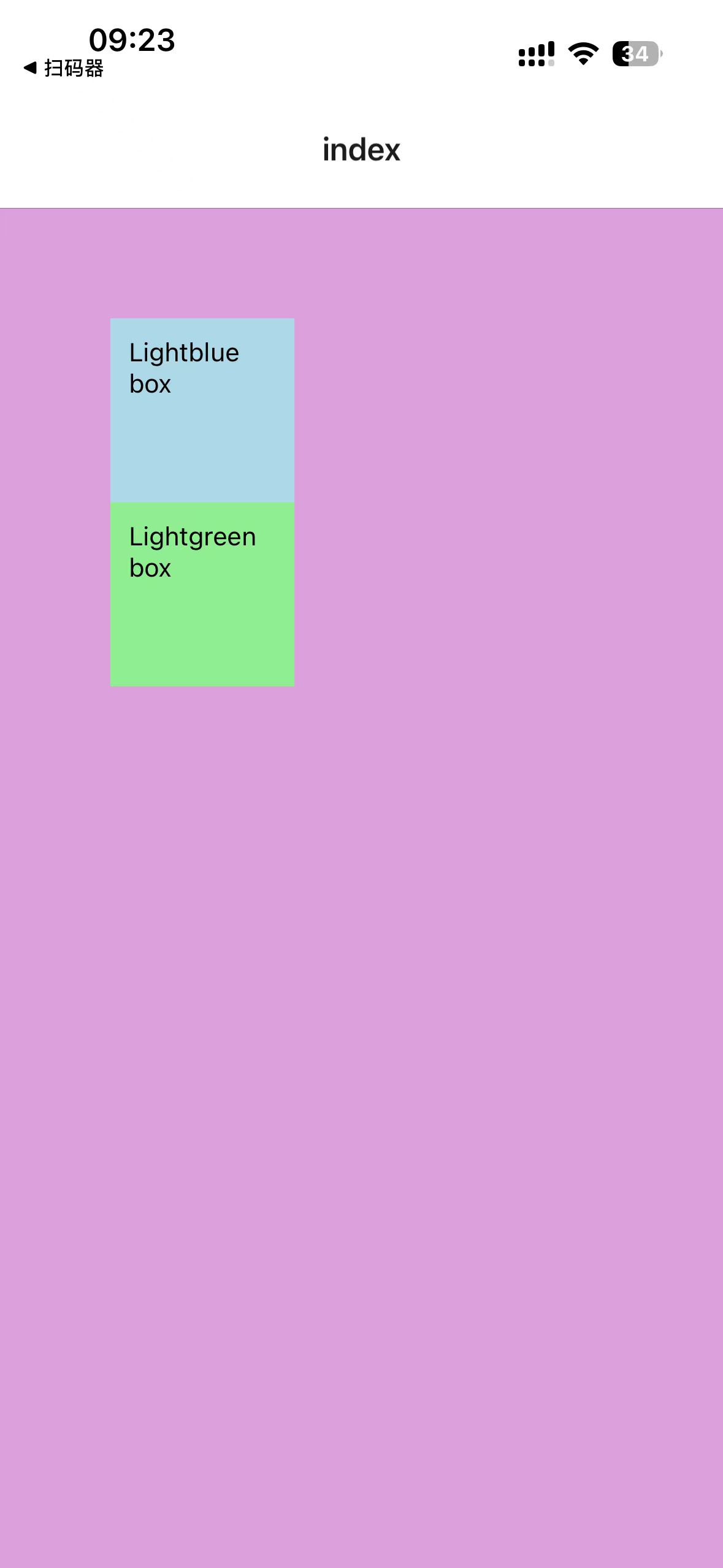
注意,style属性的值如果是数组,那么里面的顺序是有意义的,如果有重复的样式,后面的样式优先级高一些,后面的样式会覆盖前面的样式。
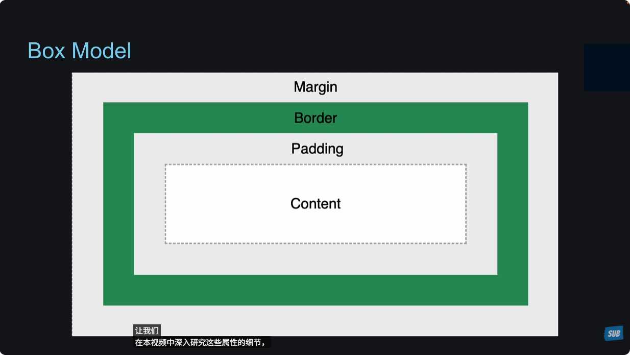
22 - Box Model
CSS的盒模型在react native中是与web端效果一致的,当然react native提供了一些自己的样式。
尺寸没有单位
react native中的所有尺寸都是没有单位的,表示的意思是与密度无关的像素。但是可以使用百分数来表示。
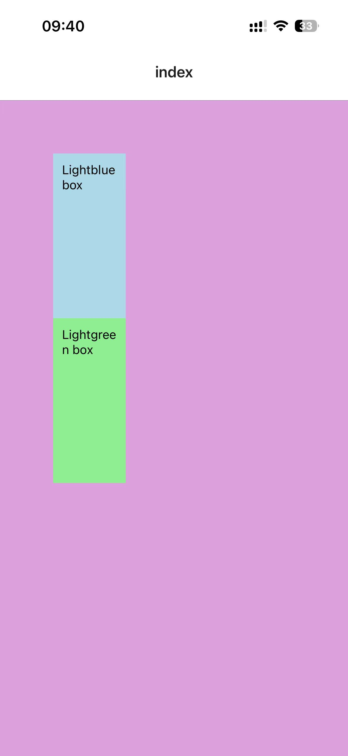
react native独特的样式
有几个独特的样式要记忆一下:paddingHorizontal,paddingVertical,marginVertical,marginHorizontal。肯定还有很多,但是先记忆这几个。
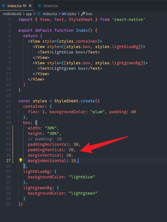
效果:
注意:这里设置了padding之后,盒子并没有变大,因为默认是boxSizing: border-box。这个值是可以设置的。
border
border: "2px solid blue",web端设置CSS的样式,在react native中不起作用。react native中需要一个一个的来设置。
效果:
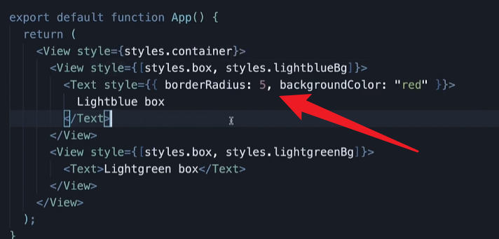
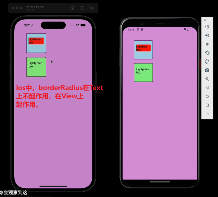
borderRadius的独特性
当borderRadius设置到Text组件上时,只在android上起作用,在ios上不起作用。解决办法就是在Text外面包裹View组件,将borderRadius设置到View上面。
当borderRadius设置到View组件上时,在ios和android上都起作用。
效果:
23 - Shadow and Elevation
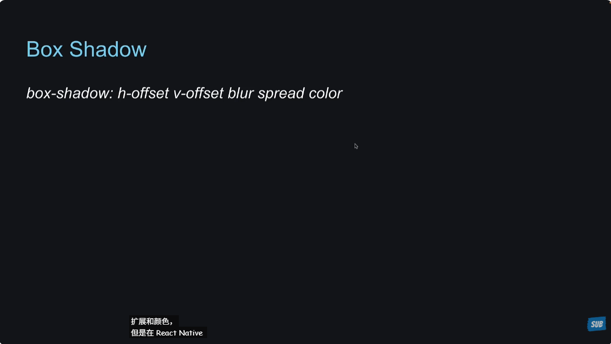
在web端写box-shadow的时候,我们像下面这样写。但是在react native中,我们要一个一个属性来写。
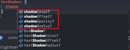
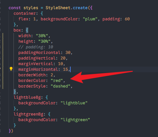
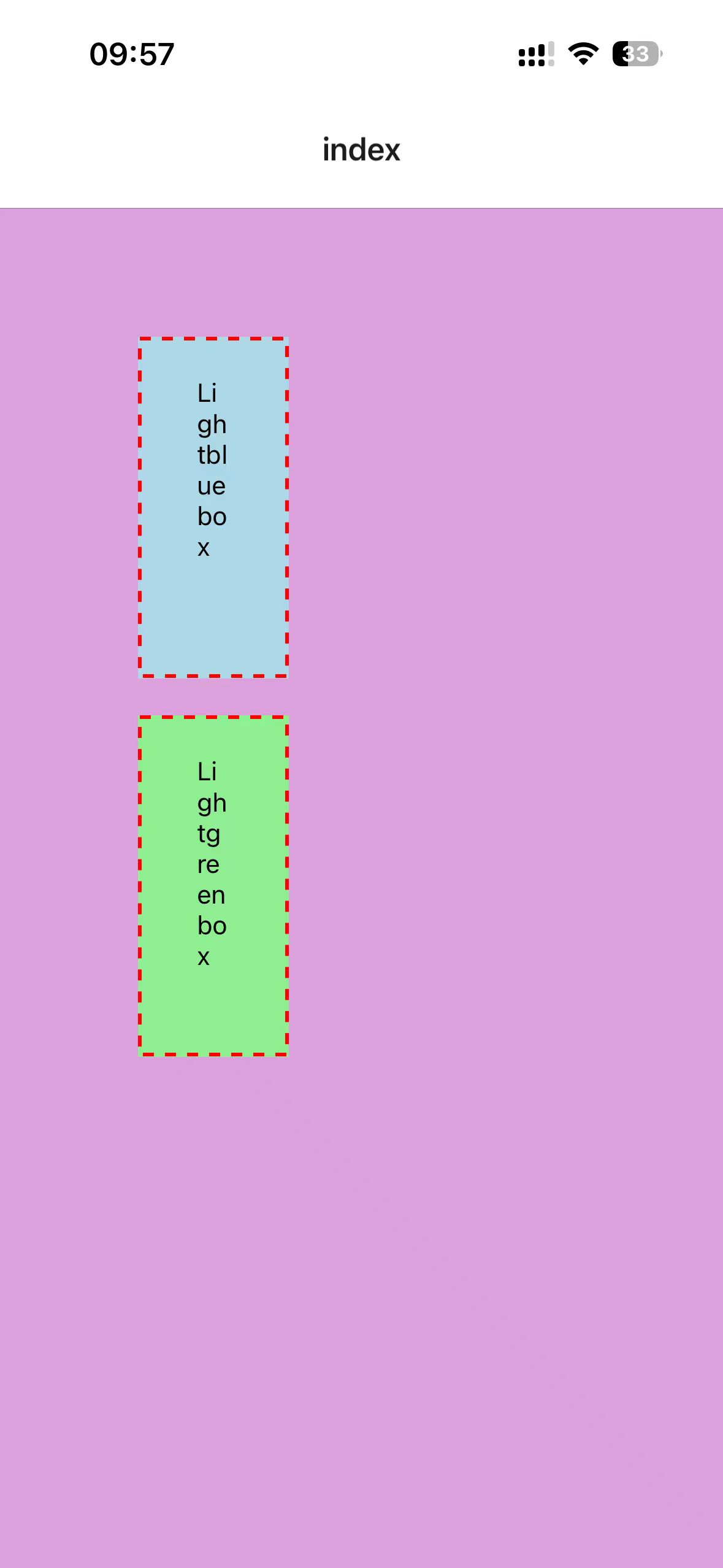
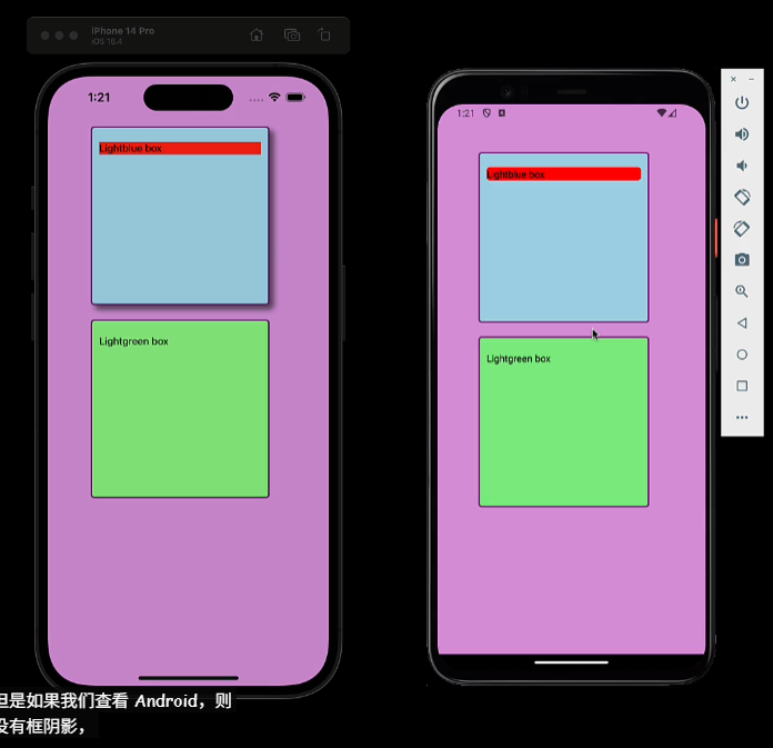
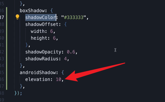
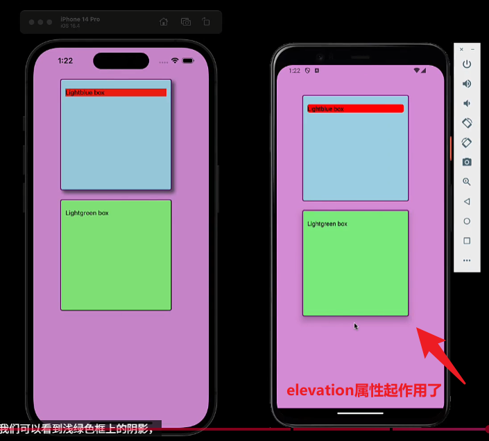
xxxxxxxxxx491// app/index.tsx23import { View, Text, StyleSheet } from 'react-native'45export default function Index() {6 return (7 <View style={styles.container}>8 <View style={[styles.box, styles.lightblueBg, styles.boxShadow]}>9 <Text style={{borderRadius: 5, backgroundColor: "lightblue"}}>Lightblue box</Text>10 </View>11 <View style={[styles.box, styles.lightgreenBg]}>12 <Text>Lightgreen box</Text>13 </View>14 </View>15 )16}1718const styles = StyleSheet.create({19 container: {20 flex: 1, backgroundColor: "plum", padding: 6021 },22 box: {23 width: 250,24 height: 250,25 // padding: 1026 paddingHorizontal: 30,27 paddingVertical: 20,28 marginVertical: 10,29 marginHorizontal: 15,30 borderWidth: 2,31 borderColor: "red",32 borderStyle: "dashed",33 },34 lightblueBg: {35 backgroundColor: "lightblue"36 },37 lightgreenBg: {38 backgroundColor: "lightgreen"39 },40 boxShadow: {41 shadowColor: "#333333",42 shadowOffset: {43 width: 6,44 height: 645 },46 shadowOpacity: 0.6,47 shadowRadius: 448 }49})在第一个盒子上面设置boxShadow,可以看到在ios上生效了,但是在android端没有生效。
怎么解决这个问题呢?使用elevation样式属性来解决。还有一些第三方库来解决这个问题,这个可以做项目的时候找一下。
24 - Style Inheritance
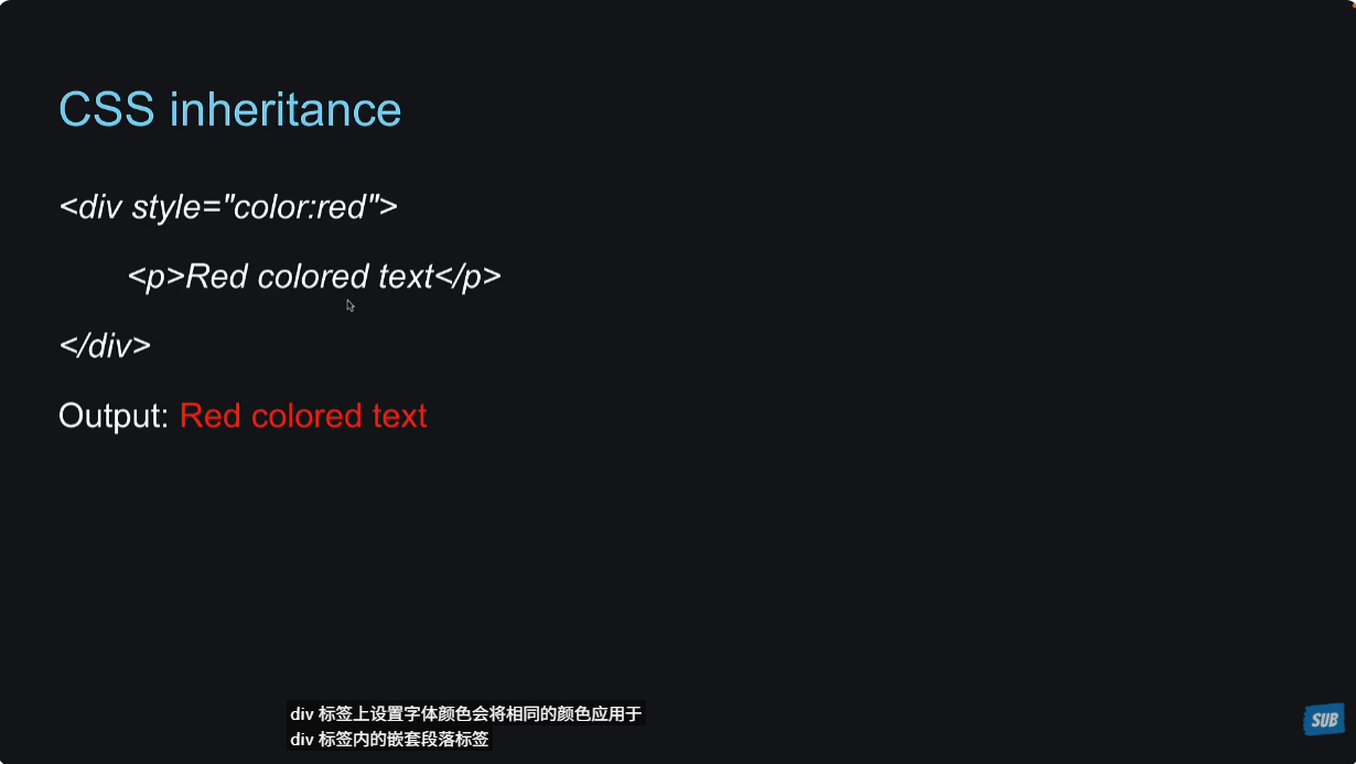
在web端的css中,样式会继承。像下面这个案例,在div上设置字体颜色,里面的p标签的字体会继承color属性。
在react native中,View和Text之间是没有样式继承的,看下面这个案例:
xxxxxxxxxx31<View style={{backgroundColor: "#000", color: "white"}}>2 <Text>Style Inheritance</Text>3</View>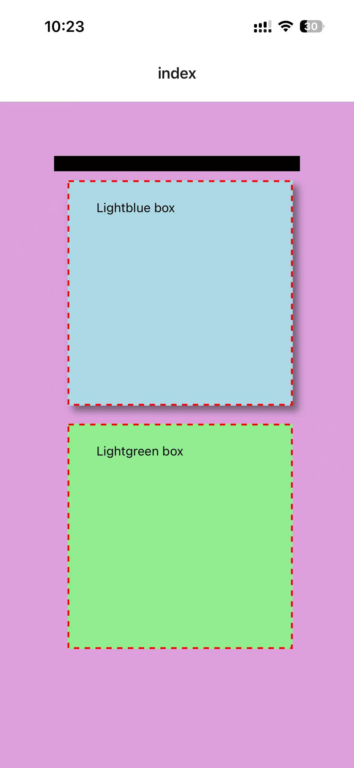
但是Text与Text的嵌套,是有样式继承的。
xxxxxxxxxx31<View style={{ backgroundColor: "#000" }}>2 <Text style={{ color: "#fff" }}>Style Inheritance <Text style={{ fontWeight: 600, fontSize: 20 }}>in bold</Text></Text>3</View>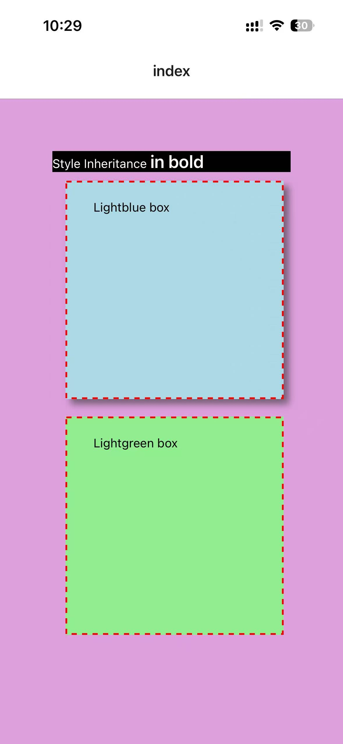
25 - Layout with Flexbox
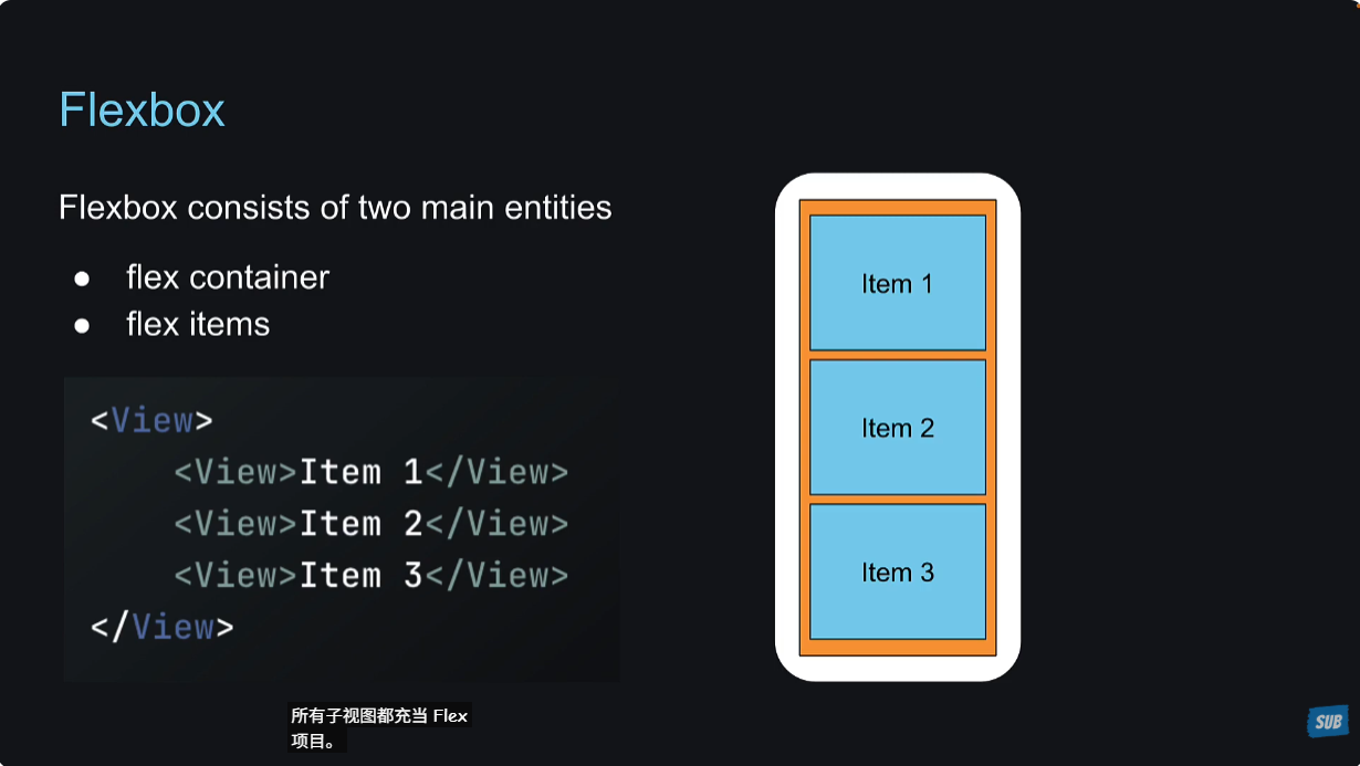
在react native中,最核心的布局方式就是使用flexbox。
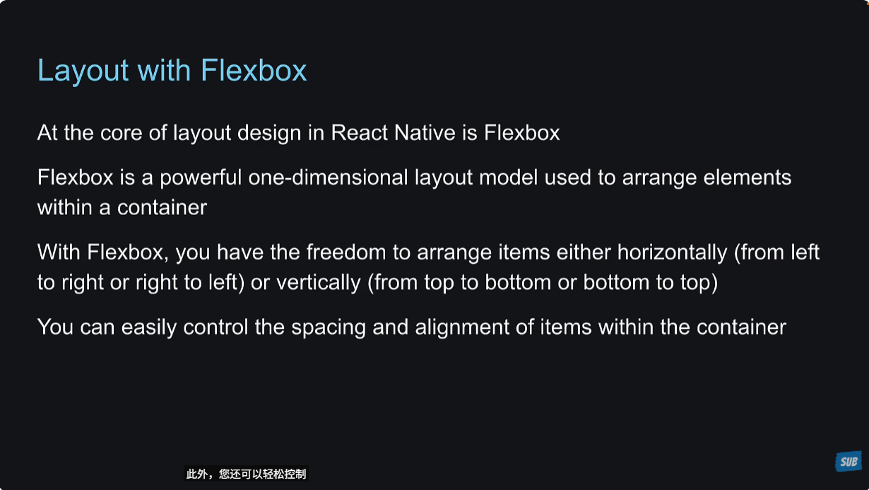
flexbox里面有两个主要的实体,flex容器和flex子级。
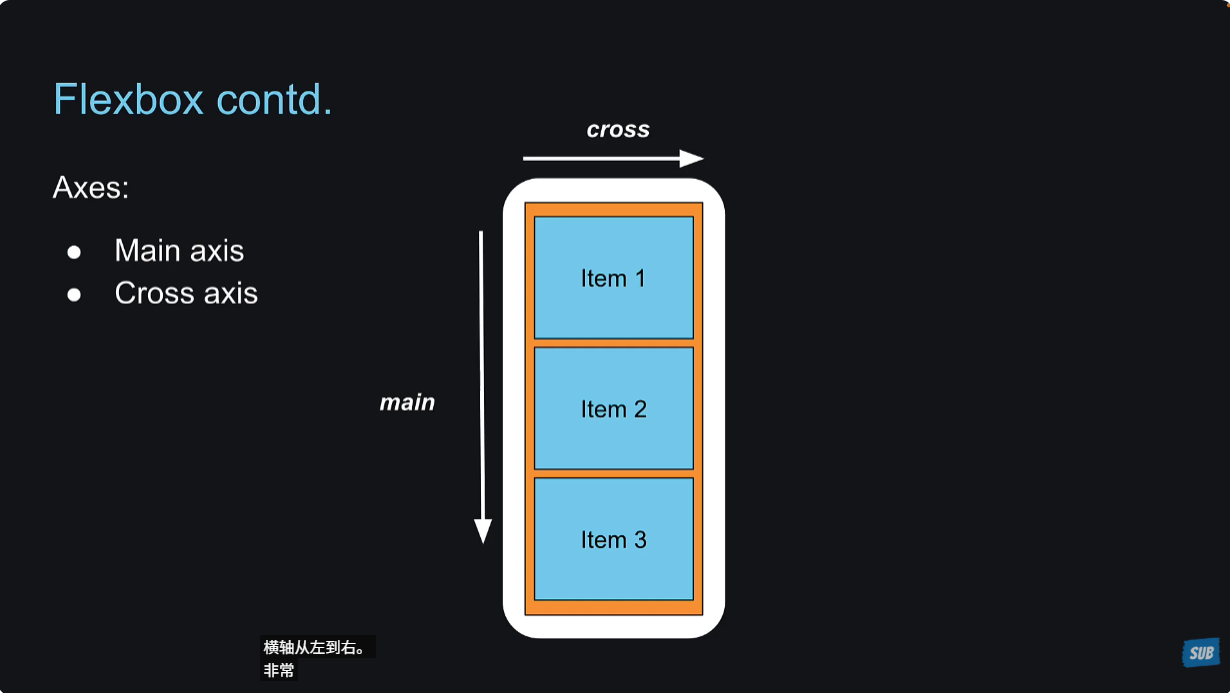
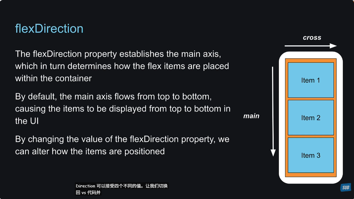
与web端的flex布局不同,react native里面的main轴,是从上到下的。
学习react native里面的flexbox布局也很简单,熟悉它的属性、了解这些属性的作用、用起来就行了。
26 - Code Setup
这节课就是为了讲解flexbox做准备。创建一个Box组件。
xxxxxxxxxx301// HelloWorld/components/Box.tsx23import { View, Text, StyleSheet } from 'react-native'4import type { PropsWithChildren } from 'react';5import type { StyleProp, ViewStyle } from 'react-native';67type BoxProps = PropsWithChildren<{8 style?: StyleProp<ViewStyle>9}>;1011export default function Box({ children, style }: BoxProps) {12 return (13 <View style={[styles.box, style]}>14 <Text style={styles.text}>{children}</Text>15 </View>16 )17}1819const styles = StyleSheet.create({20 box: {21 backgroundColor: "white",22 padding: 2023 },24 text: {25 fontSize: 24,26 fontWeight: "bold",27 textAlign: "center",28 color: "#fff"29 }30})引入到app/index.tsx中
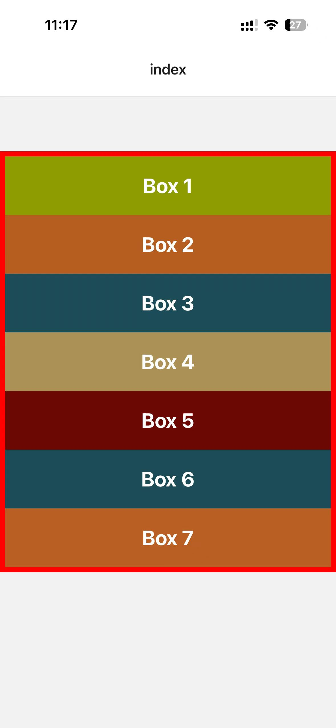
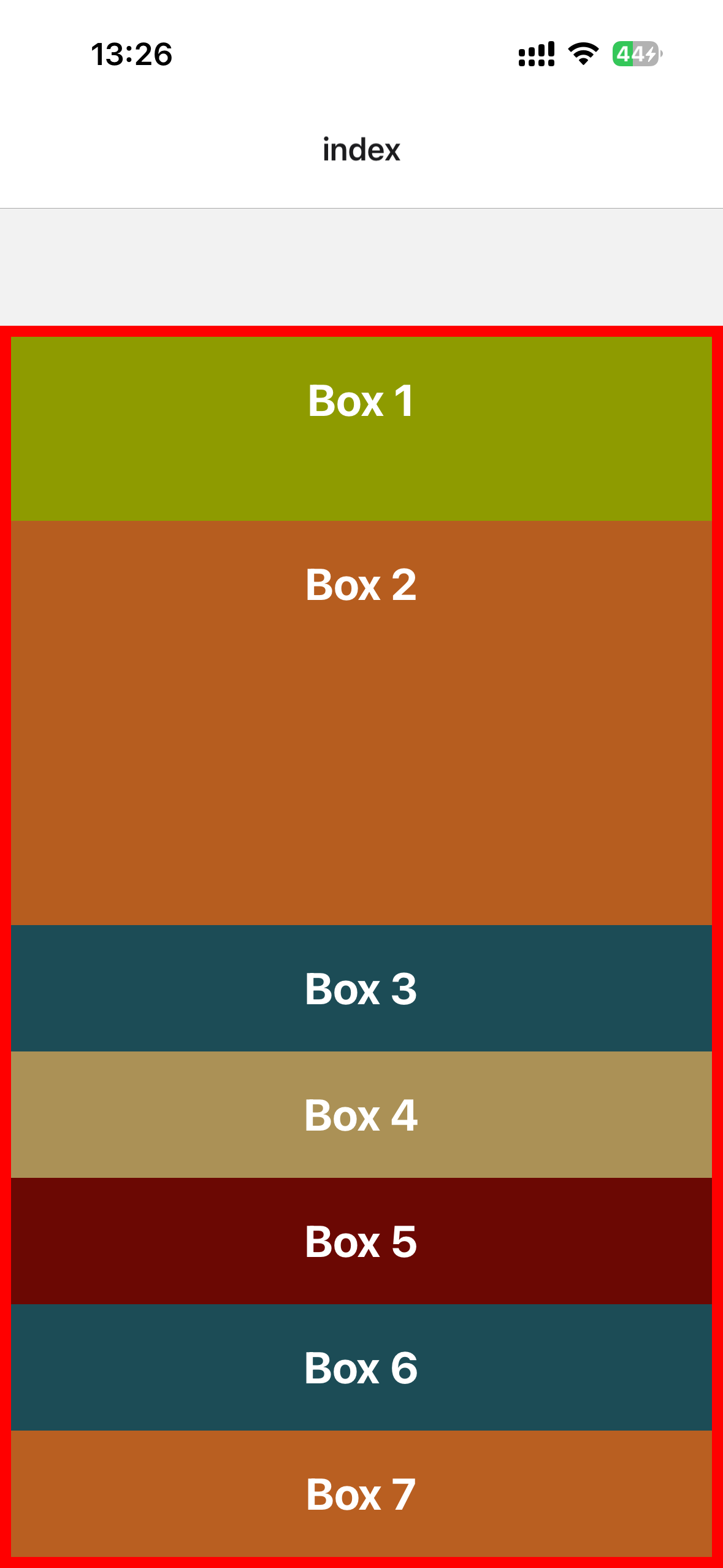
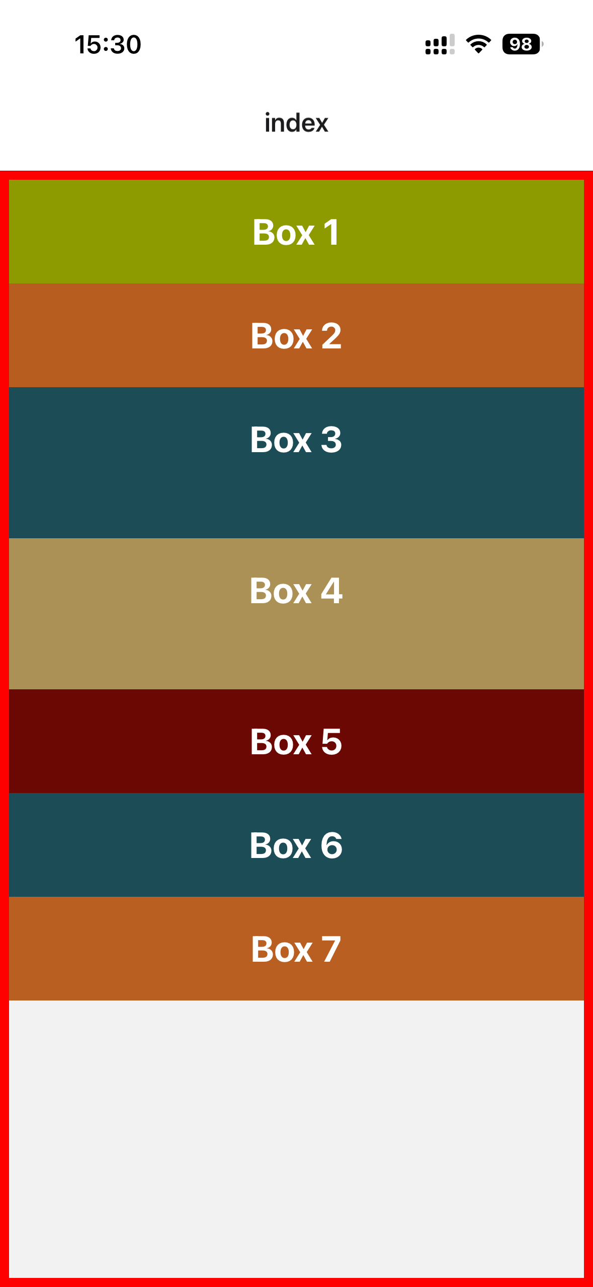
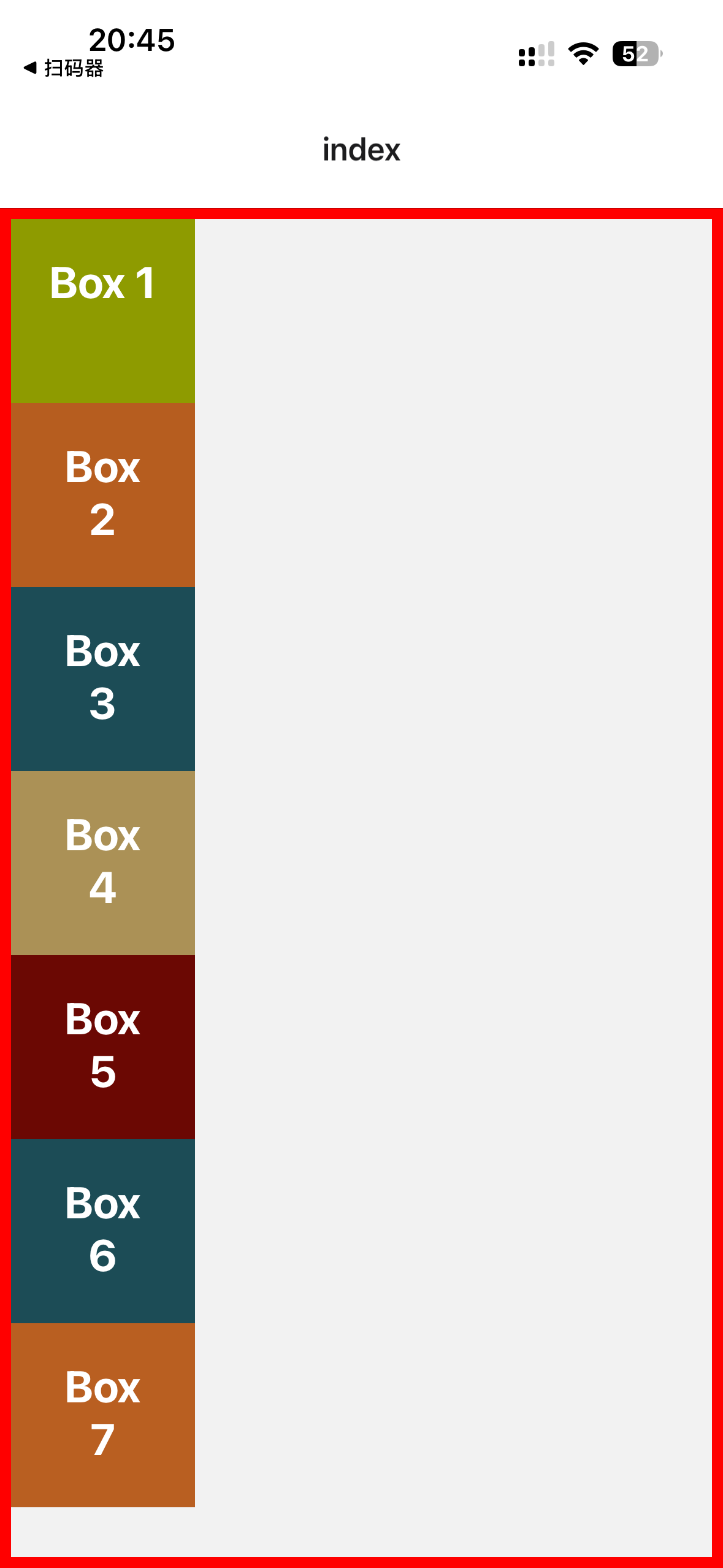
xxxxxxxxxx261// app/index.tsx23import Box from '@/components/Box'4import { View, StyleSheet } from 'react-native'56export default function Index() {7 return (8 <View style={styles.container}>9 <Box style={{backgroundColor: "#8e9b00"}}>Box 1</Box>10 <Box style={{backgroundColor: "#b65d1f"}}>Box 2</Box>11 <Box style={{backgroundColor: "#1c4c56"}}>Box 3</Box>12 <Box style={{backgroundColor: "#ab9156"}}>Box 4</Box>13 <Box style={{backgroundColor: "#6b0803"}}>Box 5</Box>14 <Box style={{backgroundColor: "#1c4c56"}}>Box 6</Box>15 <Box style={{backgroundColor: "#b95f21"}}>Box 7</Box>16 </View>17 )18}1920const styles = StyleSheet.create({21 container: {22 marginTop: 64,23 borderWidth: 6,24 borderColor: "red"25 },26})效果如下:
27 - Flex
注意:
与web端的flexbox布局不同,react native里面不需要先定义
display: flex;,react native默认设置View组件的display属性为flex,所以不需要设置。
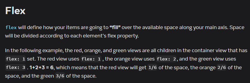
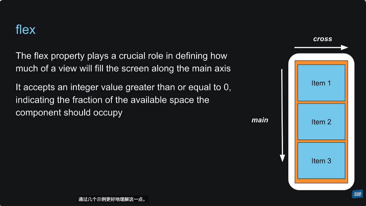
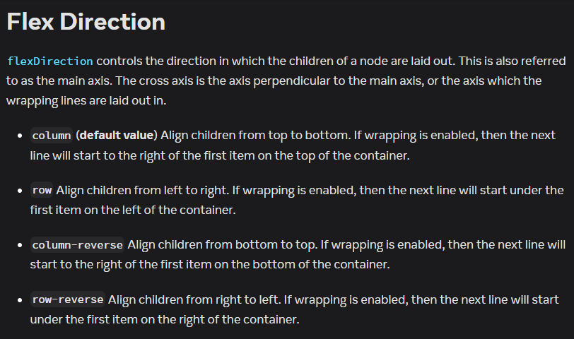
这节课讲解flexbox里面的flex属性,这个属性的作用是定义flex items怎么沿着flexDirection填充可用空间。在react native中,flexDirection默认是column。
如果有多个flex items,那么flex的值就是占可用空间的比例。
这里有一个重要的概念,什么是可用空间(available space)?
In the React Native documentation, "available space" refers to the remaining space along the main axis of a flex container that is not occupied by the elements' intrinsic sizes (e.g., their content or fixed dimensions) after the layout is calculated. This space is then distributed among the child elements based on their flex properties.
在 React Native 的文档中,“可用空间”(available space)指的是 Flex 容器沿着主轴方向上,扣除子元素固有尺寸(例如内容或固定尺寸)后剩余的空间。这个空间会根据子元素的 flex 属性按比例分配给它们。
详细解释
- 主轴:由 flexDirection 属性决定(例如 column 表示纵向,row 表示横向)。
- 固有尺寸:每个子元素根据其内容或固定尺寸(例如文本大小、填充等)占据的最小空间。
- 可用空间:Flex 容器总空间减去子元素的固有尺寸(以及可能的边距或填充)后剩下的部分。
- flex 分配:剩余的“可用空间”会根据每个子元素的 flex 值按比例分配。
我们经常在View组件上使用flex: 1来表示占用整个available的空间。这一点为什么能成立呢?可能是因为最后打包的代码中,app外层还是包裹了一层View的,所以这里直接定义flex:1就可以占用整个available空间了。
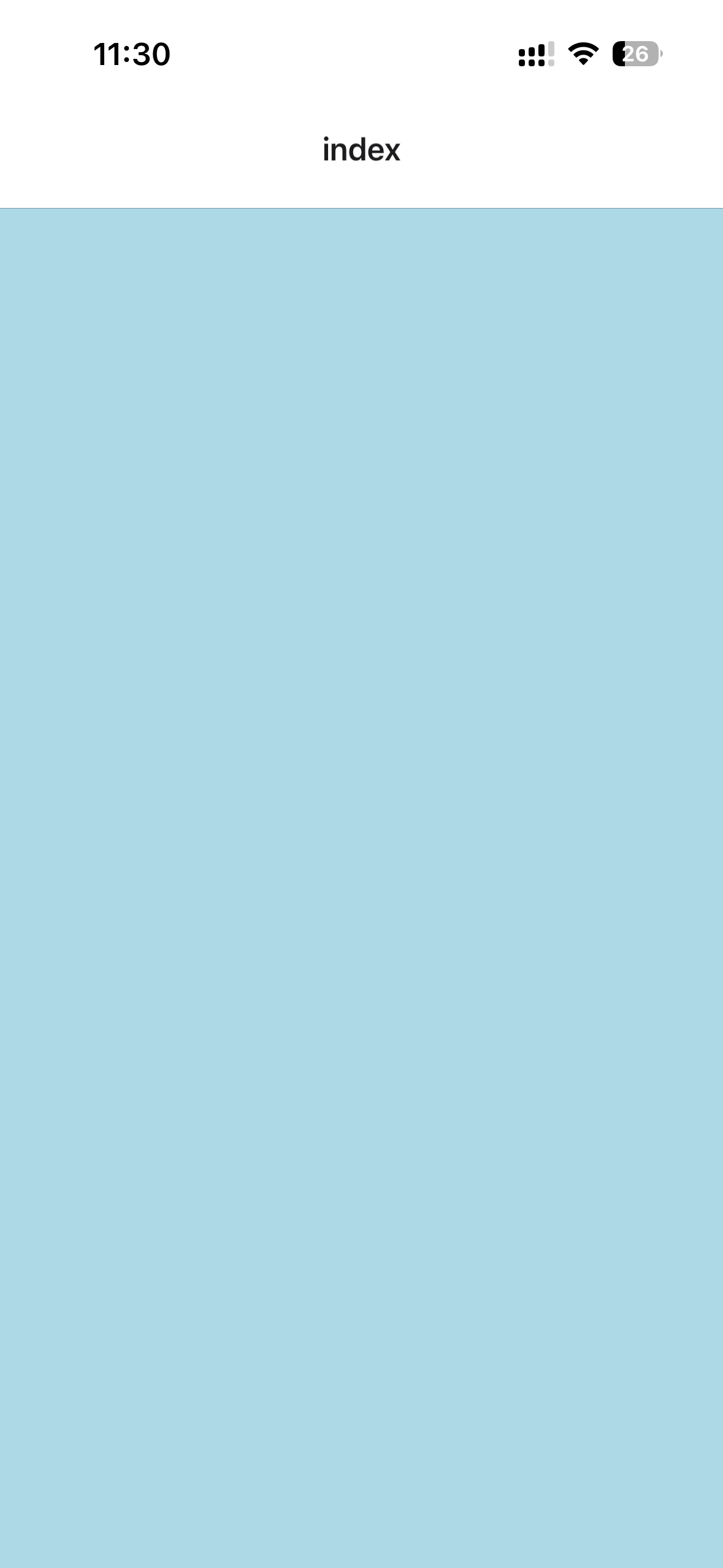
xxxxxxxxxx91// app/index.tsx23import { View, StyleSheet } from 'react-native'45export default function Index() {6 return (7 <View style={{backgroundColor: "lightblue", flex: 1}}></View>8 )9}效果:
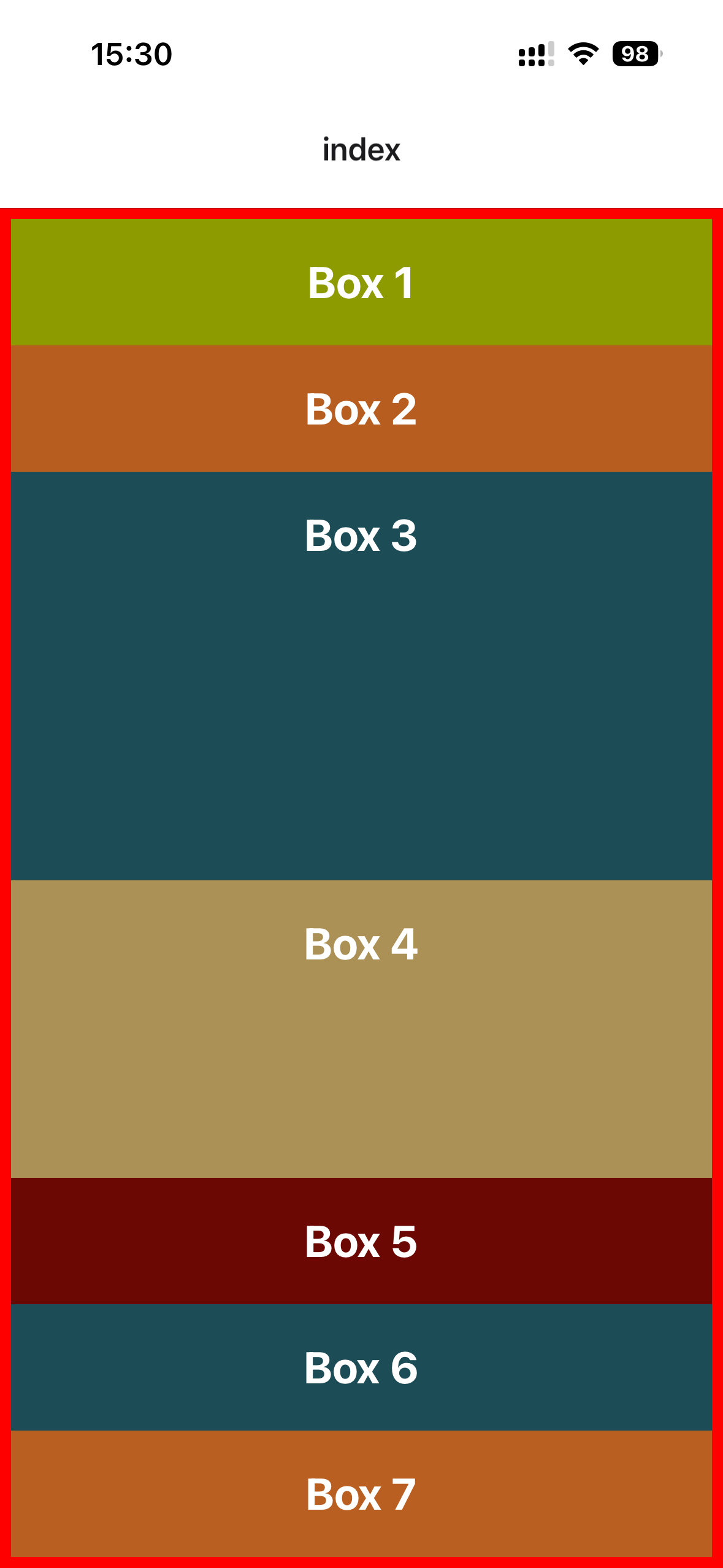
设置一下子元素的flex属性,看一下效果:
xxxxxxxxxx281// app/index.tsx23import Box from '@/components/Box'4import { View, StyleSheet } from 'react-native'56export default function Index() {7 return (8 // <View style={{backgroundColor: "lightblue", flex: 1}}></View>9 <View style={styles.container}>10 <Box style={{backgroundColor: "#8e9b00", flex: 1}}>Box 1</Box>11 <Box style={{backgroundColor: "#b65d1f", flex: 3}}>Box 2</Box>12 <Box style={{backgroundColor: "#1c4c56"}}>Box 3</Box>13 <Box style={{backgroundColor: "#ab9156"}}>Box 4</Box>14 <Box style={{backgroundColor: "#6b0803"}}>Box 5</Box>15 <Box style={{backgroundColor: "#1c4c56"}}>Box 6</Box>16 <Box style={{backgroundColor: "#b95f21"}}>Box 7</Box>17 </View>18 )19}2021const styles = StyleSheet.create({22 container: {23 flex: 1,24 marginTop: 64,25 borderWidth: 6,26 borderColor: "red"27 },28})效果:
28 - Flex Direction
在container这个样式里面设置flexDirection,可以看一下效果。
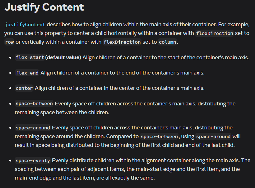
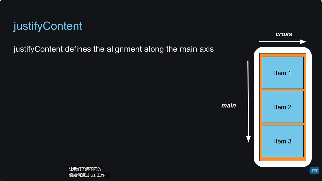
29 - Justify Content
justifyContent是设置在main axis上的对齐方式。
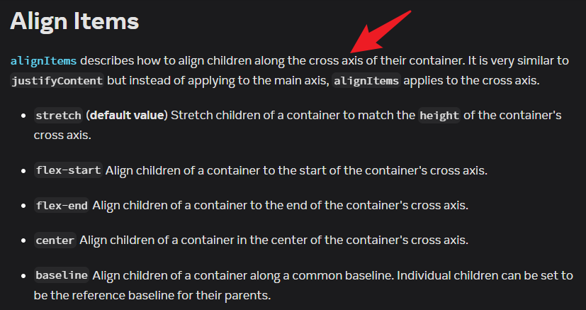
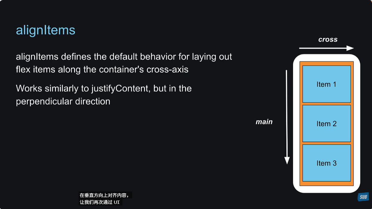
30 - Align Items
alignItems是设置在cross axis上的对齐方式。
31 - Align Self
与alignItems属性类似,alignSelf有5种值。但是与alignItems不同,alignItems是设置到父元素上的,而alignSelf是设置到子元素上的,并且它的值会覆盖父元素上alignItems的值。
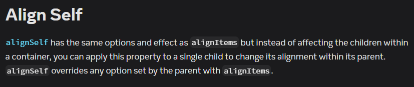
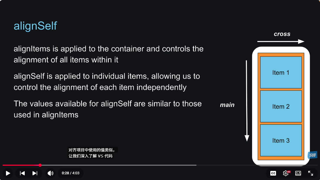
alignSelf的默认值是auto,它会继承父元素的alignItems的值,如果父元素没有设置alignItems的值,那么alignItems的默认值就是stretch。所以子元素的alignSelf的值就是stretch。
为什么要说这一点呢?就是为了强调alignSelf的默认值并不是stretch,而是auto。
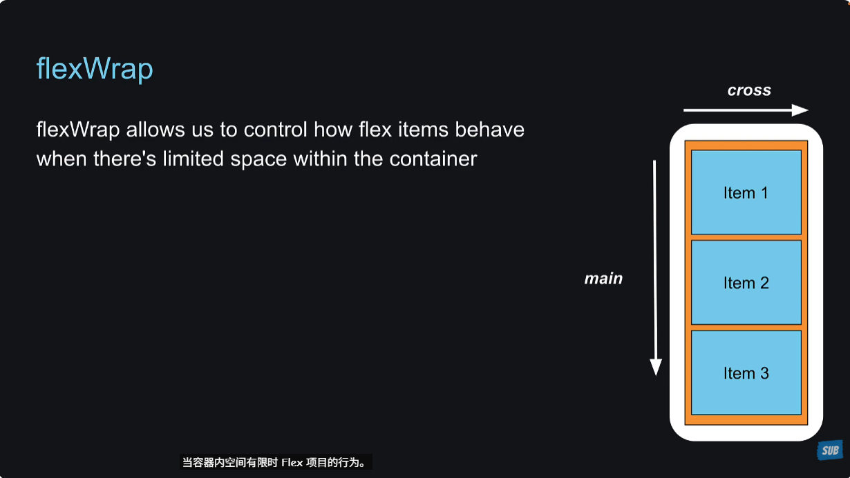
32 - Flex Wrap
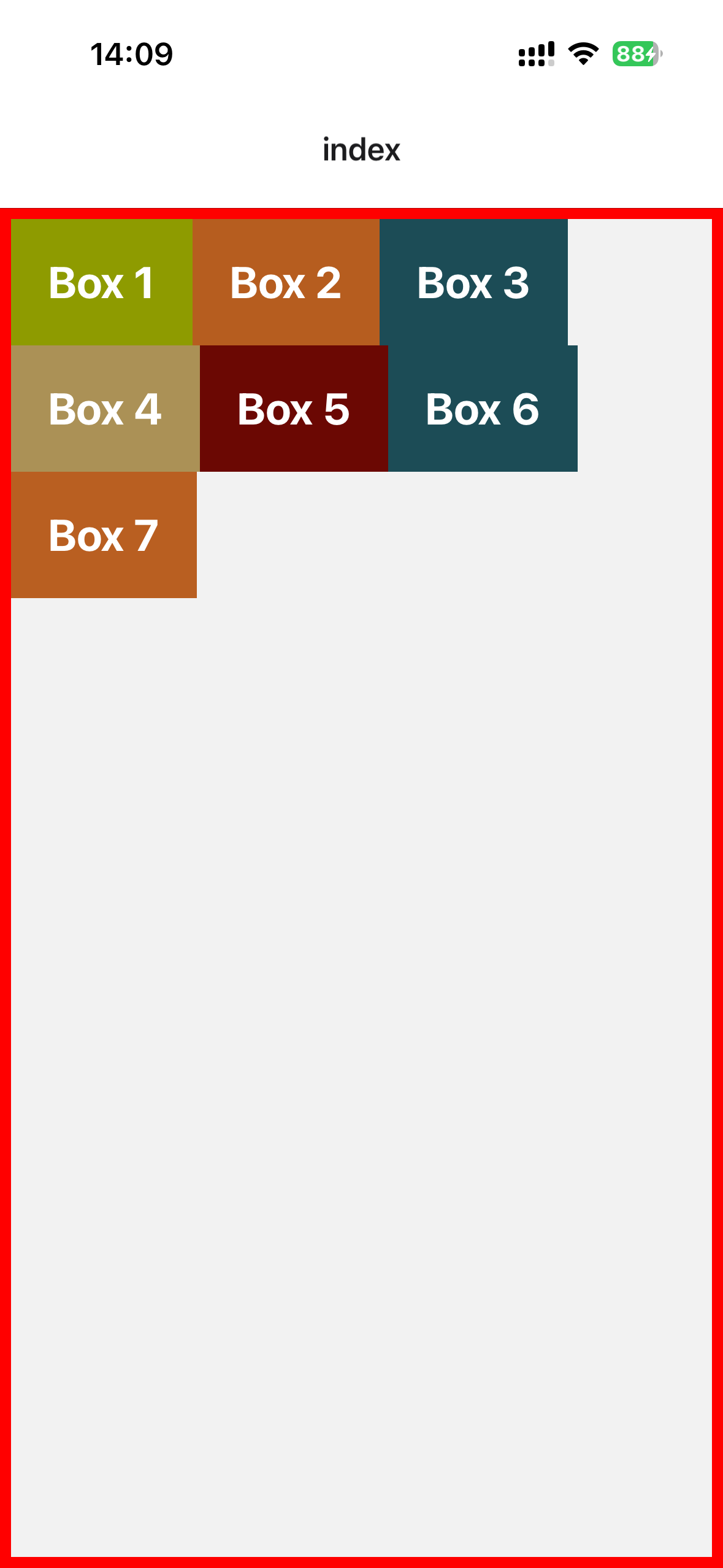
xxxxxxxxxx281// app/index.tsx23import Box from '@/components/Box'4import { View, StyleSheet } from 'react-native'56export default function Index() {7 return (8 <View style={styles.container}>9 <Box style={{backgroundColor: "#8e9b00"}}>Box 1</Box>10 <Box style={{backgroundColor: "#b65d1f"}}>Box 2</Box>11 <Box style={{backgroundColor: "#1c4c56"}}>Box 3</Box>12 <Box style={{backgroundColor: "#ab9156"}}>Box 4</Box>13 <Box style={{backgroundColor: "#6b0803"}}>Box 5</Box>14 <Box style={{backgroundColor: "#1c4c56"}}>Box 6</Box>15 <Box style={{backgroundColor: "#b95f21"}}>Box 7</Box>16 </View>17 )18}1920const styles = StyleSheet.create({21 container: {22 flex: 1,23 flexDirection: "row",24 flexWrap: "wrap",25 borderWidth: 6,26 borderColor: "red"27 },28})效果:
flexWrap我觉得还是蛮重要的,因为无论是H5还是小程序,我都遇到过九宫格的样式,我到现在都没有找到很好的解决办法。搜索了一下,还是使用计算宽度的方式来实现,flexbox布局倒是没有什么。
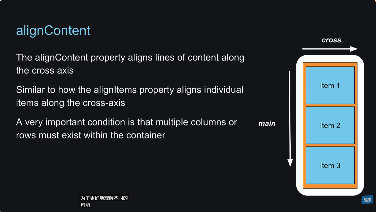
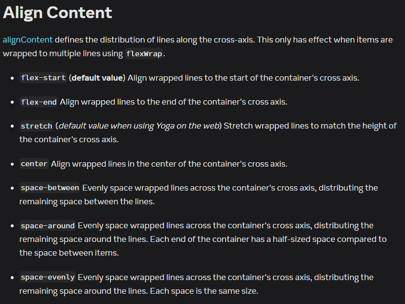
33 - Align Content
当使用了flexWrap: wrap或者wrap-reverse之后,设置alignContent才能生效。alignContent用来定义cross axis上的布局。
但是之前已经有了alignItems啊,这不是重复了吗?之前已经说了,alignContent只有在设置了flexWrap: wrap或者wrap-reverse之后才会生效,此时如果设置了alignItems是不会生效的,必须使用alignContent来设置。
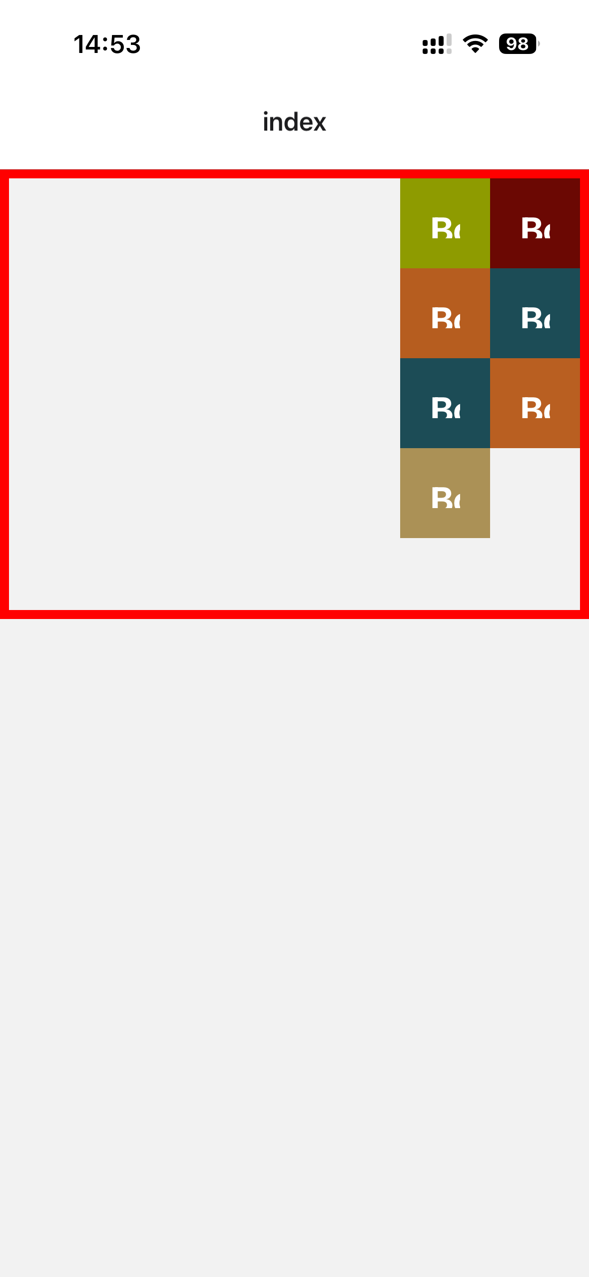
xxxxxxxxxx281// app/index.tsx23import Box from '@/components/Box'4import { View, StyleSheet } from 'react-native'56export default function Index() {7 return (8 <View style={styles.container}>9 <Box style={{backgroundColor: "#8e9b00"}}>Box 1</Box>10 <Box style={{backgroundColor: "#b65d1f"}}>Box 2</Box>11 <Box style={{backgroundColor: "#1c4c56"}}>Box 3</Box>12 <Box style={{backgroundColor: "#ab9156"}}>Box 4</Box>13 <Box style={{backgroundColor: "#6b0803"}}>Box 5</Box>14 <Box style={{backgroundColor: "#1c4c56"}}>Box 6</Box>15 <Box style={{backgroundColor: "#b95f21"}}>Box 7</Box>16 </View>17 )18}1920const styles = StyleSheet.create({21 container: {22 height: 300,23 flexWrap: "wrap",24 alignContent: "flex-end",25 borderWidth: 6,26 borderColor: "red"27 },28})效果:
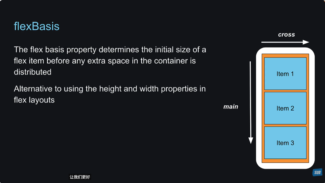
34 - Gap
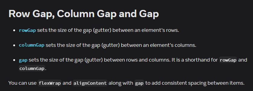
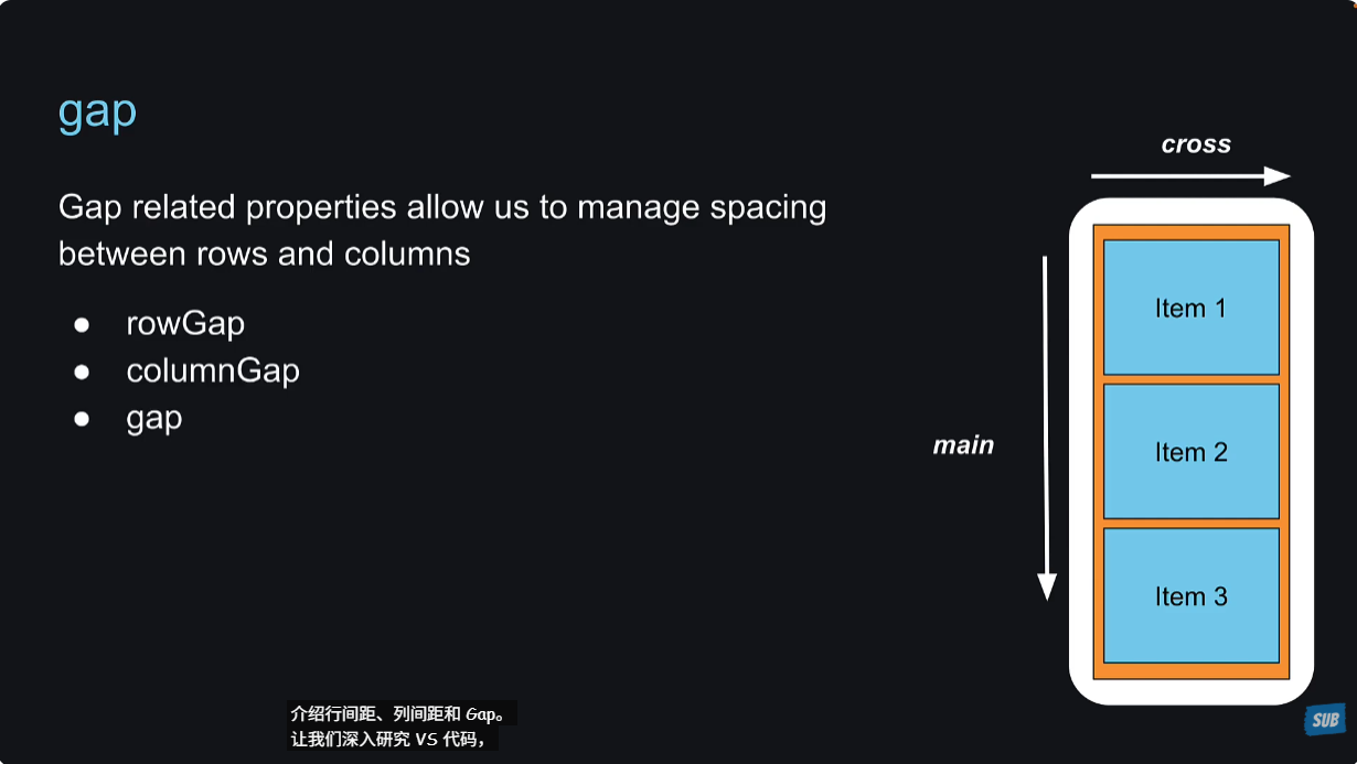
gap属性我一直不敢用,老是设置margin、padding来实现。其实gap搞清楚了非常好用,设置gap只对子元素之间起作用,对子元素和父元素之间的关系不造成影响,搞清楚了这一点,就大胆使用。
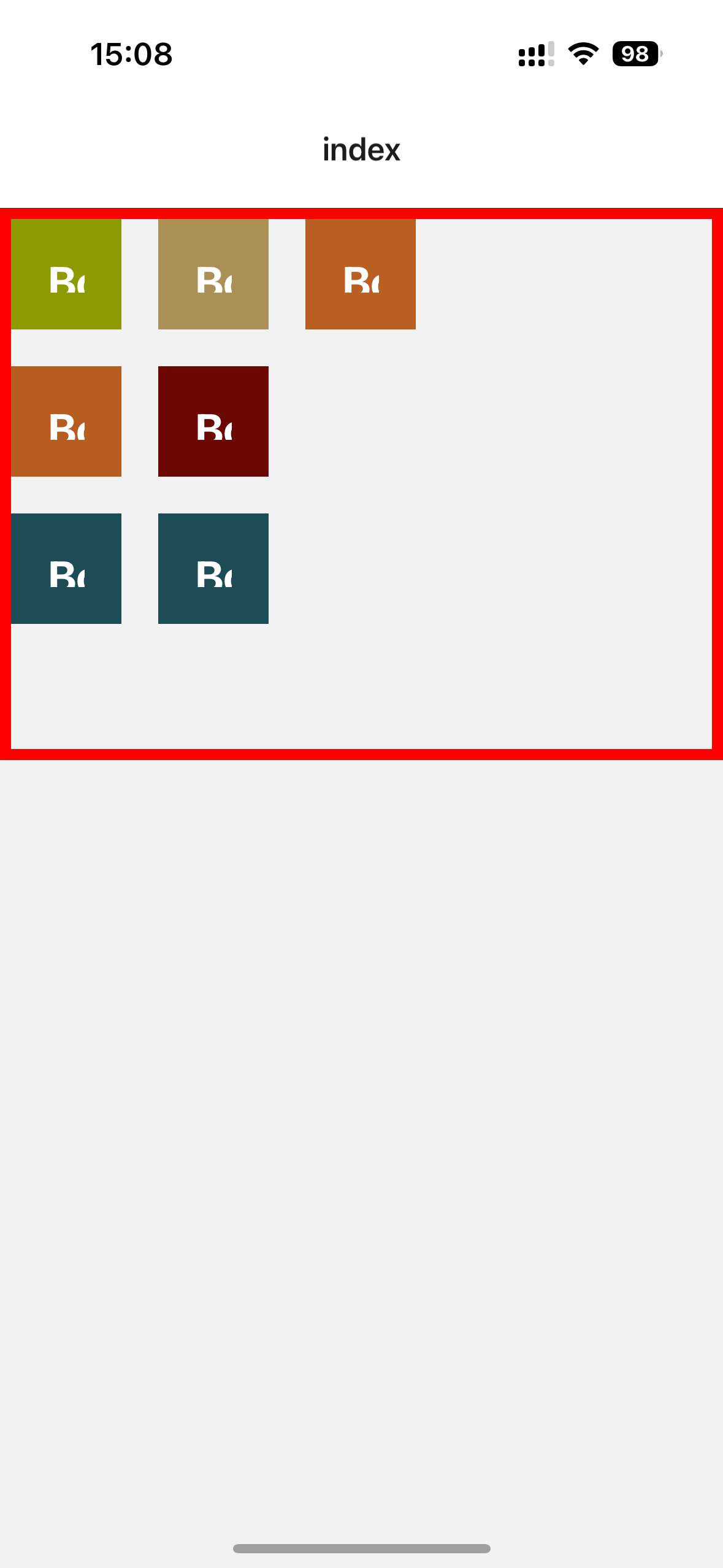
xxxxxxxxxx291// app/index.tsx23import Box from '@/components/Box'4import { View, StyleSheet } from 'react-native'56export default function Index() {7 return (8 // <View style={{backgroundColor: "lightblue", flex: 1}}></View>9 <View style={styles.container}>10 <Box style={{backgroundColor: "#8e9b00"}}>Box 1</Box>11 <Box style={{backgroundColor: "#b65d1f"}}>Box 2</Box>12 <Box style={{backgroundColor: "#1c4c56"}}>Box 3</Box>13 <Box style={{backgroundColor: "#ab9156"}}>Box 4</Box>14 <Box style={{backgroundColor: "#6b0803"}}>Box 5</Box>15 <Box style={{backgroundColor: "#1c4c56"}}>Box 6</Box>16 <Box style={{backgroundColor: "#b95f21"}}>Box 7</Box>17 </View>18 )19}2021const styles = StyleSheet.create({22 container: {23 height: 300,24 flexWrap: "wrap",25 gap: 20,26 borderWidth: 6,27 borderColor: "red"28 },29})效果:
35 - Flex Basis
如果flexDirection是row,那么设置flexBasis的值表示的就是子元素的width,如果flexDirection是column,那么设置flexBasis的值表示的就是子元素的height。
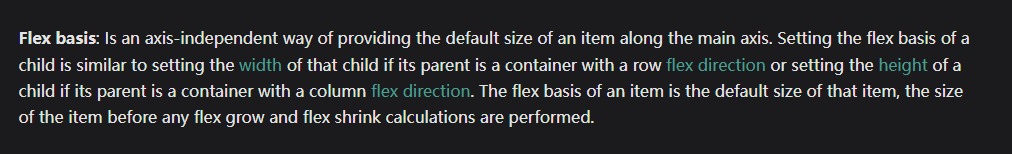
为什么不直接设置width或者height呢?
原因是设置了flex-basis,表示初始的width或height,同时加上flex:1,可以占据其余的available space。而设置了width或者height之后,然后设置flex:1,会比设置flexBasis的要小一些。原因是available space is distributed propertionally with respect to the flex basis, not with width or height property.
下面是案例说明:
xxxxxxxxxx271// app/index.tsx23import Box from '@/components/Box'4import { View, StyleSheet } from 'react-native'56export default function Index() {7 return (8 // <View style={{backgroundColor: "lightblue", flex: 1}}></View>9 <View style={styles.container}>10 <Box style={{backgroundColor: "#8e9b00"}}>Box 1</Box>11 <Box style={{backgroundColor: "#b65d1f"}}>Box 2</Box>12 <Box style={{backgroundColor: "#1c4c56", flexBasis: 100}}>Box 3</Box>13 <Box style={{backgroundColor: "#ab9156", height: 100}}>Box 4</Box>14 <Box style={{backgroundColor: "#6b0803"}}>Box 5</Box>15 <Box style={{backgroundColor: "#1c4c56"}}>Box 6</Box>16 <Box style={{backgroundColor: "#b95f21"}}>Box 7</Box>17 </View>18 )19}2021const styles = StyleSheet.create({22 container: {23 flex: 1,24 borderWidth: 6,25 borderColor: "red"26 },27})刚开始效果是一样的:
Box 3和Box 4都加上flex:1的样式之后,效果就不一样了:
36 - Flex Shrink
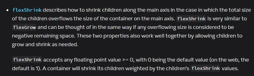
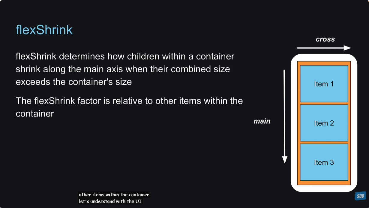
shrink本意是收缩,flexShrink的意思就是,当子元素的总宽度或总高度超过了父元素的宽度或高度,那么子元素会被压缩,react native中的默认值为0,可以是任意大于等于0的浮点数。0表示不压缩。
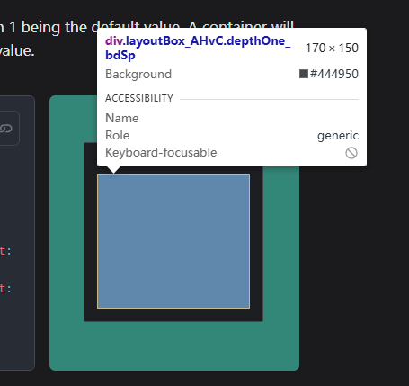
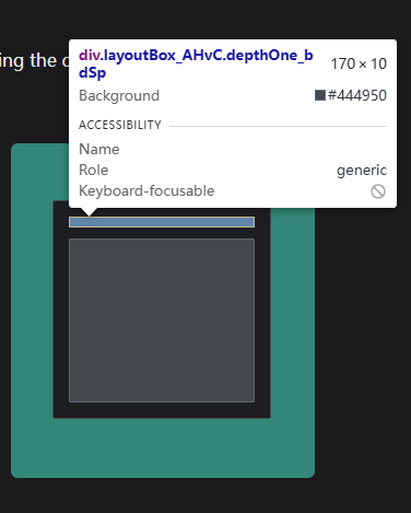
https://www.yogalayout.dev/docs/styling/flex-basis-grow-shrink,这个例子可以说明,我设置第二个节点的flexShrink为0,那么被压缩的就是第一个节点。
xxxxxxxxxx111<Layout config={{useWebDefaults: false}}>2 <Node3 style={{4 width: 200,5 height: 200,6 padding: 10,7 }}>8 <Node style={{margin: 5, flexShrink: 5, height: 150}} />9 <Node style={{margin: 5, flexShrink: 0, height: 150}} />10 </Node>11</Layout>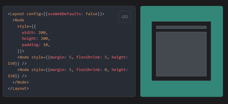
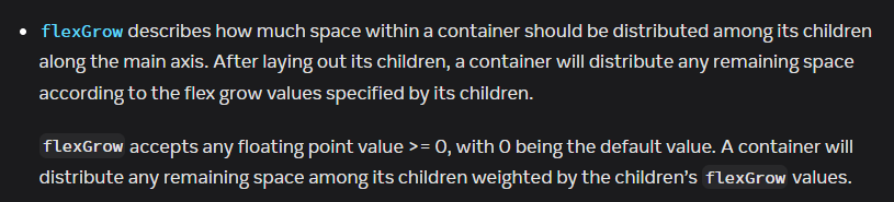
37 - Flex Grow
grow的本意是生长,flexGrow的意思就是,子元素的总宽度或者总高度没有达到父元素的宽度或高度,那么设置了flexGrow的元素就会变宽或者变高,使得总宽度或总高度达到父元素的宽度或高度。
flexGrow的默认值是0,意味着子元素不会默认变宽或者变高。
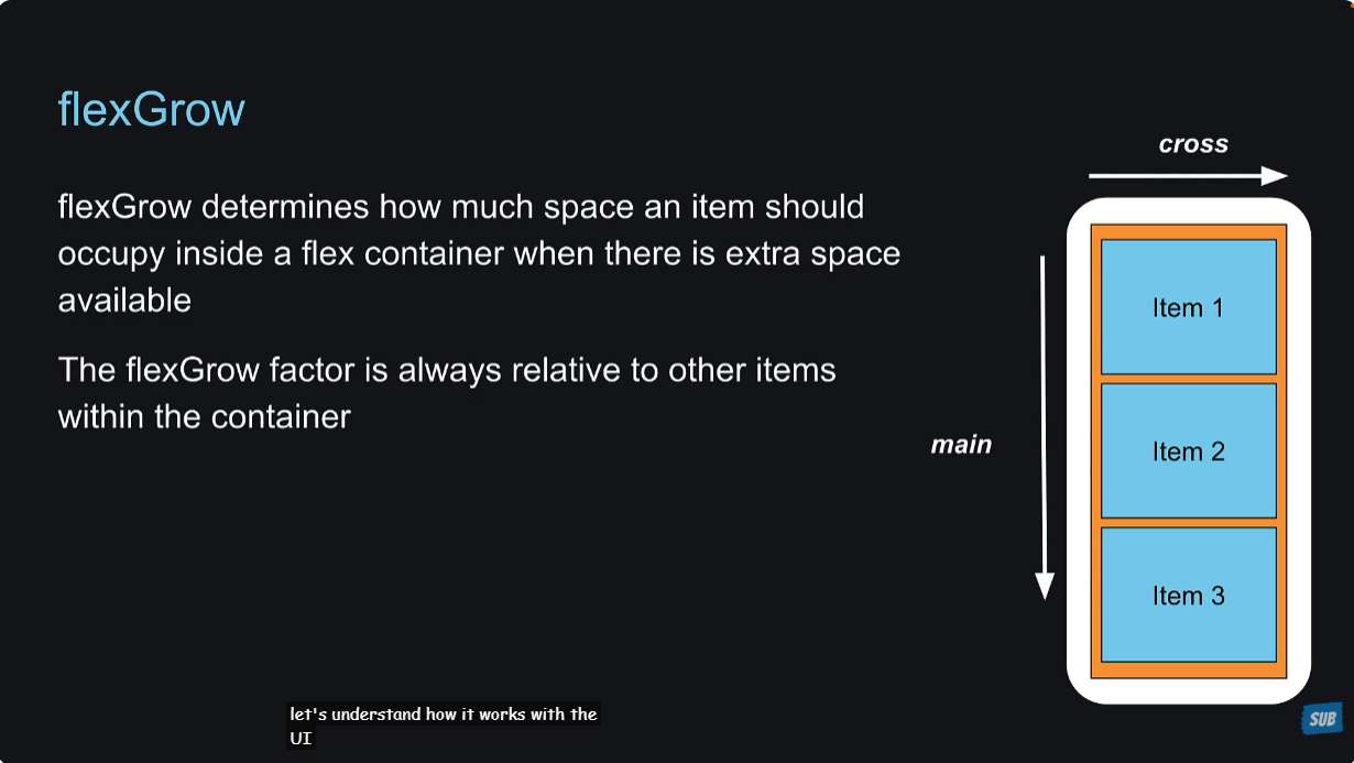
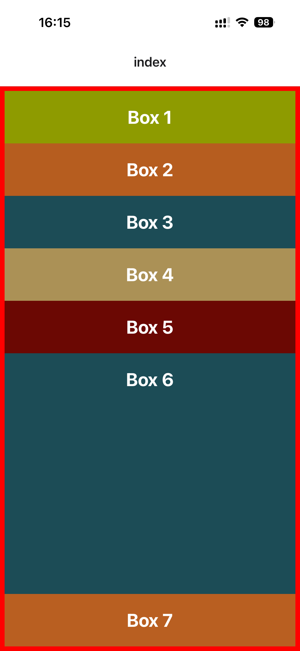
将Box 6设置flexGrow:1,看一下效果:
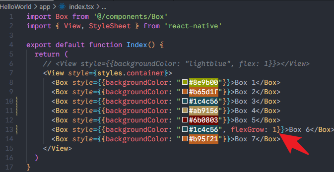
效果:
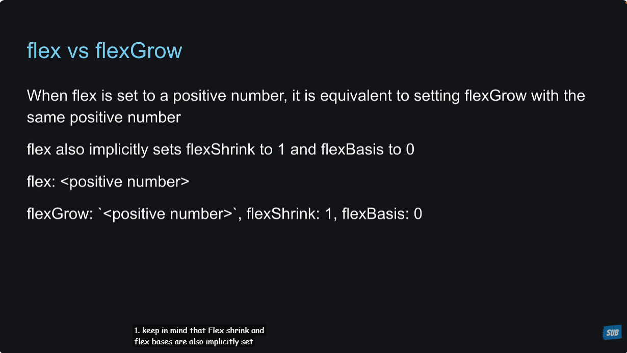
那之前不是学习了flex:1也能达到同样的效果吗?二者有说明区别吗?
有的,设置flex:1实际上设置了三个属性:flexGrow: number, flexShrink: 1, flexBasis: 0。
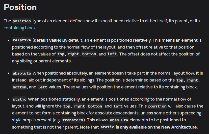
38 - Relative and Absolute Layout
react native中的position默认就是relative布局,那么在某个组件上使用position:absolute的时候,是不需要在其父组件上特别设置position:relative的,这一点与web端的position布局不同,要注意。
将Box组件设置为width:100,height:100,,方便展示样式。
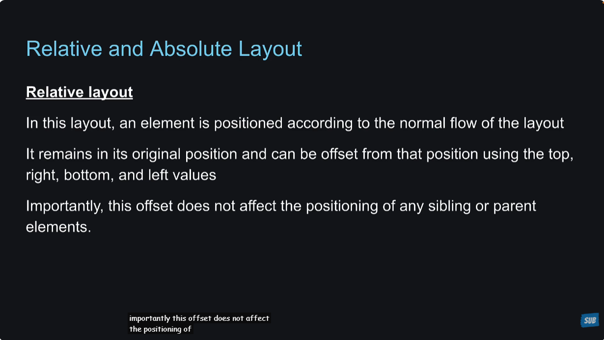
position: relative
在Box 1和Box 5上设置top和left属性,因为它们默认的position是relative,看一下效果。
xxxxxxxxxx261// app/index.tsx23import Box from '@/components/Box'4import { View, StyleSheet } from 'react-native'56export default function Index() {7 return (8 <View style={styles.container}>9 <Box style={{backgroundColor: "#8e9b00", top: 75, left: 75}}>Box 1</Box>10 <Box style={{backgroundColor: "#b65d1f"}}>Box 2</Box>11 <Box style={{backgroundColor: "#1c4c56"}}>Box 3</Box>12 <Box style={{backgroundColor: "#ab9156"}}>Box 4</Box>13 <Box style={{backgroundColor: "#6b0803", top: 75, left: 75}}>Box 5</Box>14 <Box style={{backgroundColor: "#1c4c56"}}>Box 6</Box>15 <Box style={{backgroundColor: "#b95f21"}}>Box 7</Box>16 </View>17 )18}1920const styles = StyleSheet.create({21 container: {22 flex: 1,23 borderWidth: 6,24 borderColor: "red"25 },26})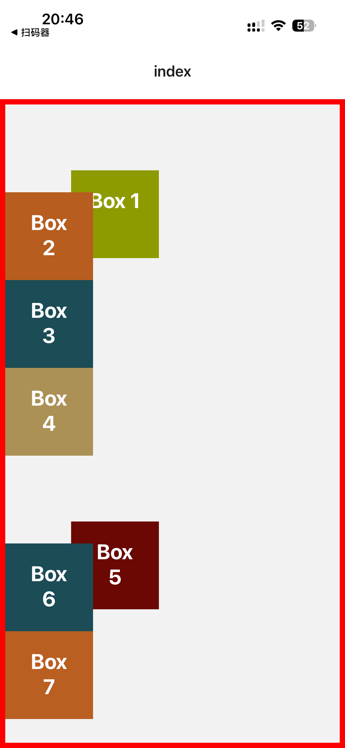
可以看到position:relative时,设置了left和top,是不影响它的兄弟组件或者父组件的布局的。
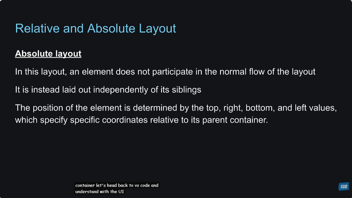
position: absolute
将Box 5的position设置为absolute,看一下效果。
xxxxxxxxxx261// app/index.tsx23import Box from '@/components/Box'4import { View, StyleSheet } from 'react-native'56export default function Index() {7 return (8 <View style={styles.container}>9 <Box style={{backgroundColor: "#8e9b00", top: 75, left: 75}}>Box 1</Box>10 <Box style={{backgroundColor: "#b65d1f"}}>Box 2</Box>11 <Box style={{backgroundColor: "#1c4c56"}}>Box 3</Box>12 <Box style={{backgroundColor: "#ab9156"}}>Box 4</Box>13 <Box style={{backgroundColor: "#6b0803",position:"absolute", top: 175, left: 85}}>Box 5</Box>14 <Box style={{backgroundColor: "#1c4c56"}}>Box 6</Box>15 <Box style={{backgroundColor: "#b95f21"}}>Box 7</Box>16 </View>17 )18}1920const styles = StyleSheet.create({21 container: {22 flex: 1,23 borderWidth: 6,24 borderColor: "red"25 },26})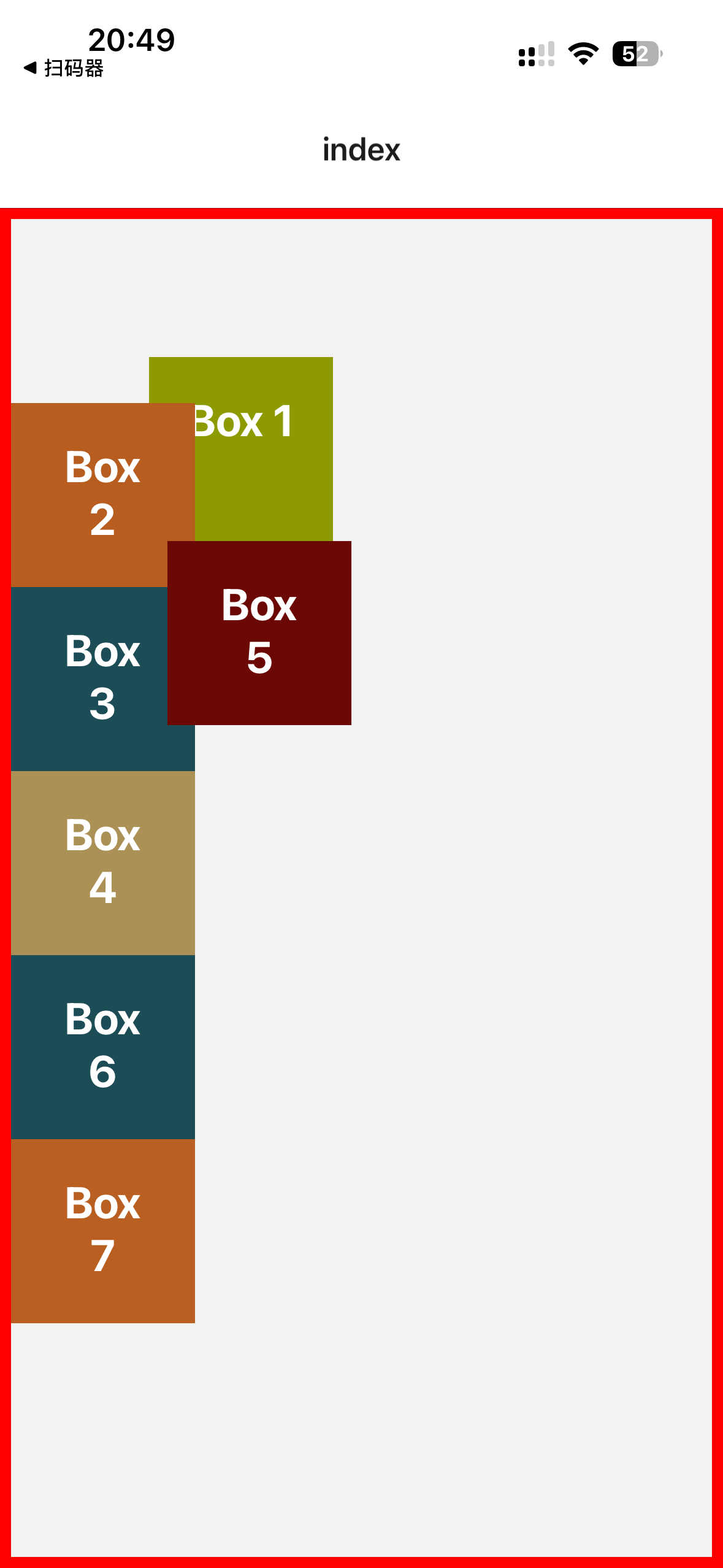
可以看到,设置为position:absolute之后,具体的位置与其父组件相关,与其兄弟组件的位置无关。
39 - Dynamic User Interfaces
动态用户界面。这节课的意思是说,之前的学习都是基于标准的iphone14和pixel 4这种设备来设置样式的,但是用户的设备可能有很多种类型,同一种设备可能竖着使用,也可能横着使用。
怎么解决这个问题呢?react native提供了一些API来帮助我们,接下来的几节课会讲到。
为了更好的学习下面的API,创建一个新项目,将app/index.tsx改成下面这样:
xxxxxxxxxx201// app/index.tsx23import { View, StyleSheet } from 'react-native'45export default function Index() {6 return (7 <View style={styles.container}>89 </View>10 )11}1213const styles = StyleSheet.create({14 container: {15 flex: 1,16 backgroundColor: "plum",17 justifyContent: "center",18 alignItems: "center",19 },20})40 - Dimensions API
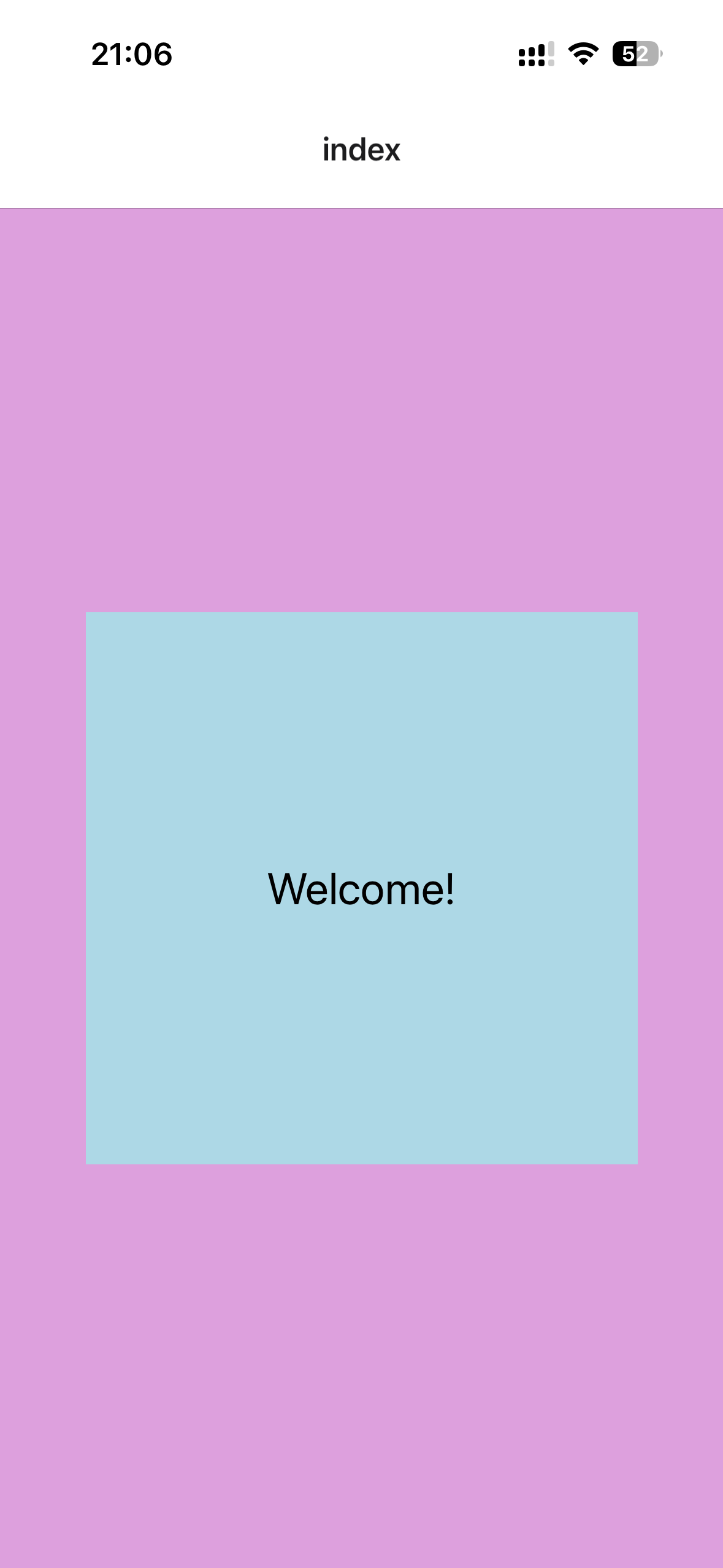
xxxxxxxxxx321// app/index.tsx23import { View, StyleSheet, Text } from 'react-native'45export default function Index() {6 return (7 <View style={styles.container}>8 <View style={styles.box}>9 <Text style={styles.text}>Welcome!</Text>10 </View>11 </View>12 )13}1415const styles = StyleSheet.create({16 container: {17 flex: 1,18 backgroundColor: "plum",19 justifyContent: "center",20 alignItems: "center",21 },22 box: {23 width: 300,24 height: 300,25 backgroundColor: "lightblue",26 alignItems: "center",27 justifyContent: "center",28 },29 text: {30 fontSize: 24,31 }32})效果:
然后在terminal里面执行shift + i,切换macos端的ios模拟器,我没有这个,就直接使用老师的截图来说明了。在ipad上面,box太小了,而且字体也太小,看的不是很清楚。
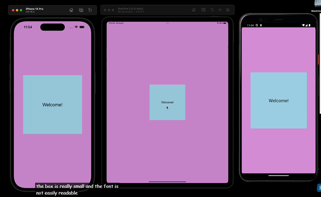
一种解决办法是在width和height上使用百分数,但是字体大小无法使用百分数,而且使用了百分数之后,在ipad上的box比例和iphone上的比例区别还是蛮大的。
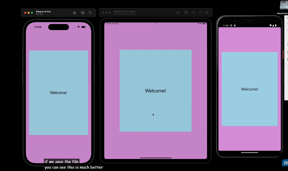
这时候就要使用dimensions API,react native提供的Dimensions这个API,可以获取到设备的宽度和高度,里面的get方法有两种值screen和window,一般使用window,因为window表示app可见的范围。
这个我感觉类似CSS里面的@media媒体查询,要定义一些屏幕的类型。
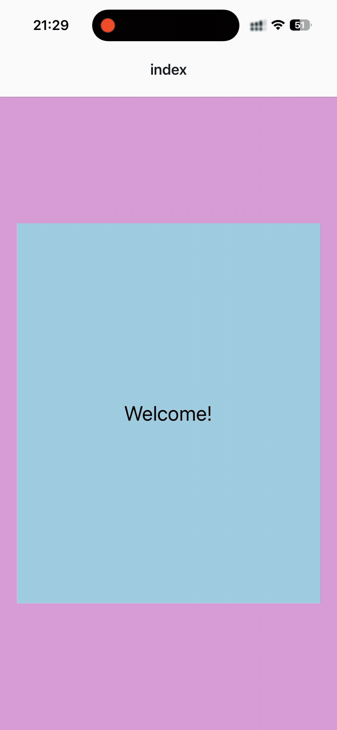
xxxxxxxxxx351// app/index.tsx23import { View, StyleSheet, Text, Dimensions } from 'react-native'45export default function Index() {6 return (7 <View style={styles.container}>8 <View style={styles.box}>9 <Text style={styles.text}>Welcome!</Text>10 </View>11 </View>12 )13}1415const dimensionWidth = Dimensions.get("window").width;16const dimensionHeight = Dimensions.get("window").height;1718const styles = StyleSheet.create({19 container: {20 flex: 1,21 backgroundColor: "plum",22 justifyContent: "center",23 alignItems: "center",24 },25 box: {26 width: dimensionWidth > 500 ? "70%" : "90%",27 height: dimensionHeight > 600 ? "60%" : "90%",28 backgroundColor: "lightblue",29 alignItems: "center",30 justifyContent: "center",31 },32 text: {33 fontSize: dimensionWidth > 500 ? 50 : 24,34 }35})效果:
41 - Dimensions API Drawback
虽然dimensions可以解决问题,但是它有一个缺点,就是当设备切换横屏、竖屏显示的时候,或者是折叠屏展开、收起的时候,需要额外设置监听事件来重新渲染,这个就比较麻烦了。
为了查看屏幕横屏的情况,需要将app.json里面的orientation的值由portrait改为default,这样横屏就可以响应了。在app/index.tsx里面输出console.log(dimensionWidth, dimensionHeight);。
terminal里面的输出:
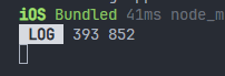
可以看到只输出了一次,屏幕旋转之后,dimensions的值并不会主动触发更新。可以使用useEffect来监听。
xxxxxxxxxx481// app/index.tsx23import { useEffect, useState } from 'react';4import { View, StyleSheet, Text, Dimensions } from 'react-native'56export default function Index() {7 const [dimensions, setDimensions] = useState({8 window: Dimensions.get("window")9 })1011 useEffect(() => {12 const subscription = Dimensions.addEventListener("change", ({ window }) => {13 setDimensions({ window });14 })15 return () => subscription?.remove();16 })1718 const { window } = dimensions;19 const dimensionWidth = window.width;20 const dimensionHeight = window.height;2122 return (23 <View style={styles.container}>24 <View style={[styles.box, {25 width: dimensionWidth > 500 ? "70%" : "90%",26 height: dimensionHeight > 600 ? "60%" : "90%",27 }]}>28 <Text style={{29 fontSize: dimensionWidth > 500 ? 50 : 24,30 }}>Welcome!</Text>31 </View>32 </View>33 )34}3536const styles = StyleSheet.create({37 container: {38 flex: 1,39 backgroundColor: "plum",40 justifyContent: "center",41 alignItems: "center",42 },43 box: {44 backgroundColor: "lightblue",45 alignItems: "center",46 justifyContent: "center",47 },48})效果:
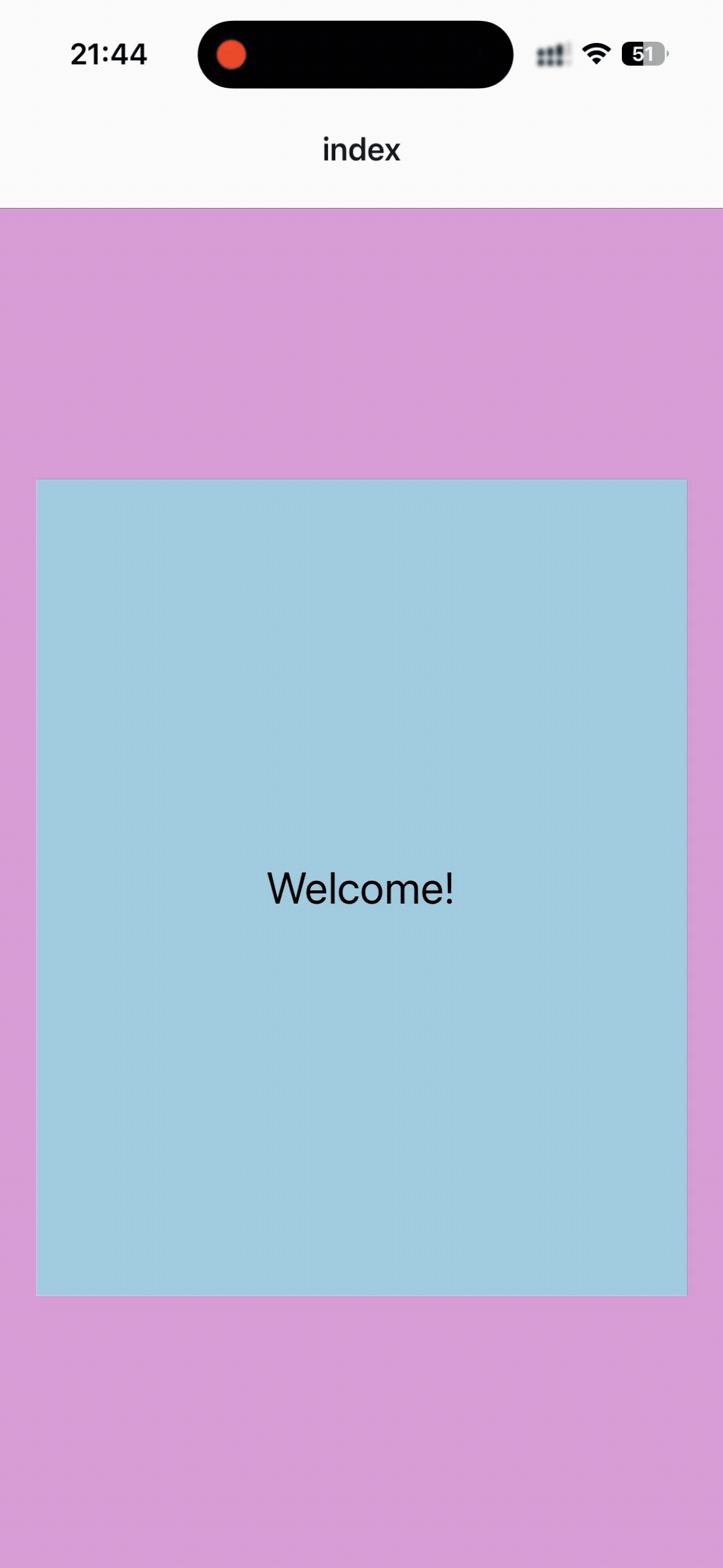
可以看到,宽度变为了屏幕宽度的70%,字体大小变为了50,说明监听成功了。但是很麻烦。
42 - useWindowDimensions
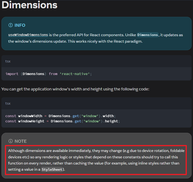
使用react native提供的useWindowDimensions,替换Dimensions这个API。当设备尺寸或者字体缩放的时候,会自动更新它的值,从而触发页面的重新渲染。
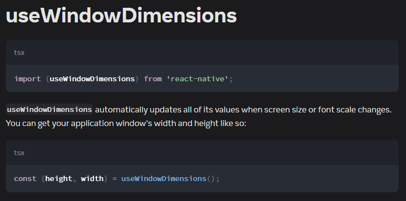
那么案例的代码就可以改为:
xxxxxxxxxx341// app/index.tsx23import { View, StyleSheet, Text, useWindowDimensions } from 'react-native'45export default function Index() {6 const { width: dimensionWidth, height: dimensionHeight } = useWindowDimensions();78 return (9 <View style={styles.container}>10 <View style={[styles.box, {11 width: dimensionWidth > 500 ? "70%" : "90%",12 height: dimensionHeight > 600 ? "60%" : "90%",13 }]}>14 <Text style={{15 fontSize: dimensionWidth > 500 ? 50 : 24,16 }}>Welcome!</Text>17 </View>18 </View>19 )20}2122const styles = StyleSheet.create({23 container: {24 flex: 1,25 backgroundColor: "plum",26 justifyContent: "center",27 alignItems: "center",28 },29 box: {30 backgroundColor: "lightblue",31 alignItems: "center",32 justifyContent: "center",33 },34})效果非常好。
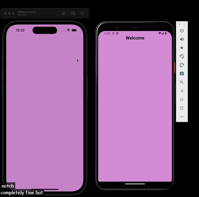
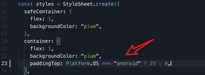
43 - SafeAreaView
现象是,如果不设置paddingTop,那么内容可能被iphone顶部的notch遮住,android端是正常的。于是就可以使用SafeAreaView来代替View组件,避免设置了paddingTop了之后,ios正常了,但是android端顶部多出来了paddingTop的高度。
这个内容被最新的react native弃用了。因为无法在我的手机上复现,所以就不用管了。
官方推荐使用react-native-safe-area-context,https://appandflow.github.io/react-native-safe-area-context/,使用方法是在root layout外层包裹一层SafeAreaProvider。
但是expo项目真的没有这种现象,可能是expo已经帮我们处理好了。
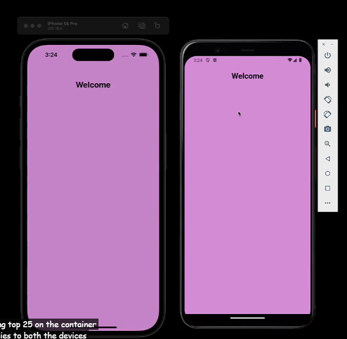
44 - Platform Specific Code
当开发跨平台应用时,最大化代码复用性是首要的,但是有时候需要为不同的平台写不同的代码。react native中有以下两种方式:
1、使用Platform module
使用Platform模块。import { Platform } from 'react-native';
案例:当为container设置padding-top时,ios和android表现不一样。
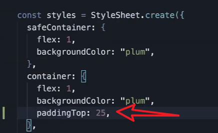
可以看到,ios的间距大一些。
① 使用 Platform.OS
此时可以通过检查 Platform.OS 的值来运行平台特定的代码:
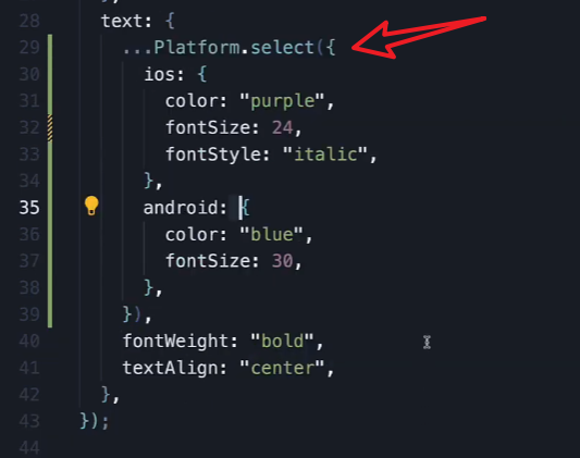
② 使用 Platform.select()
Platform.select() 方法接受一个包含平台名称作为键的对象,并返回当前平台对应的值。这对于处理样式或返回不同组件非常方便。适合更复杂的处理逻辑。
2、使用平台特定的文件扩展名
当平台间的差异很大,需要编写整个组件或模块的平台特定版本时,推荐使用平台特定的文件扩展名。
React Native 的模块解析器会自动检测并加载带有特定平台后缀的文件:
- 对于 iOS 平台,使用
.ios.后缀,例如:BigButton.ios.js。 - 对于 Android 平台,使用
.android.后缀,例如:BigButton.android.js。 - 无后缀的文件 (例如
BigButton.js) 会作为默认版本在所有平台上使用,除非存在特定平台的文件。
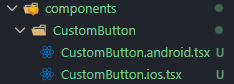
创建自定义button文件:
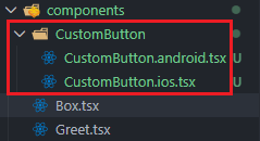
xxxxxxxxxx201// \HelloWorld\components\CustomButton\CustomButton.ios.tsx23import React from "react";4import { Pressable, Text } from "react-native";56const CustomeButton = ({ onPress, title }: { onPress: () => void; title: string }) => (7 <Pressable8 onPress={onPress}9 style={{10 justifyContent: "center",11 alignItems: "center",12 backgroundColor: "lightblue",13 borderRadius: 20,14 padding: 10,15 }}>16 <Text style={{ color: "purple", fontSize: 18 }}>{title}</Text>17 </Pressable>18);1920export default CustomeButton;CustomButton.android.tsx的代码类似,就是样式不一样,这里就不粘贴了。
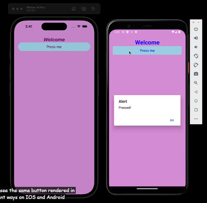
然后引入使用:
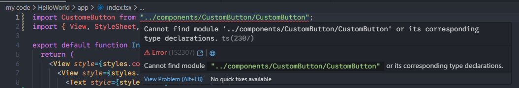
xxxxxxxxxx11import CustomeButton from "../components/CustomButton/CustomButton";查看效果,在ios和android上的样式不一样:
这个我没有做好,我定义了这样的组件:
但是引入
import CustomeButton from "../components/CustomButton/CustomButton";会报错:
这个先放在这里,以后有时间回来解决。
45 - Build a Pokemon Card (1/6)
之前我们学习了:
接下来的6节课,我们要结合已经学习的知识,做一个pokemon card的项目。 效果如下:
1、创建项目npx create-expo-app@latest --template ExerciseOne,再运行npm run reset-project,输入n。
2、修改app/index.tsx里面的内容:
xxxxxxxxxx141// app/index.tsx23import { StyleSheet, View } from "react-native";45export default function Index() {6 return <View style={styles.container}></View>;7}89const styles = StyleSheet.create({10 container: {11 flex: 1,12 backgroundColor: "#f5f5f5",13 },14});3、添加图片到assets文件夹里面去,就是pokemon相关的
4、创建组件
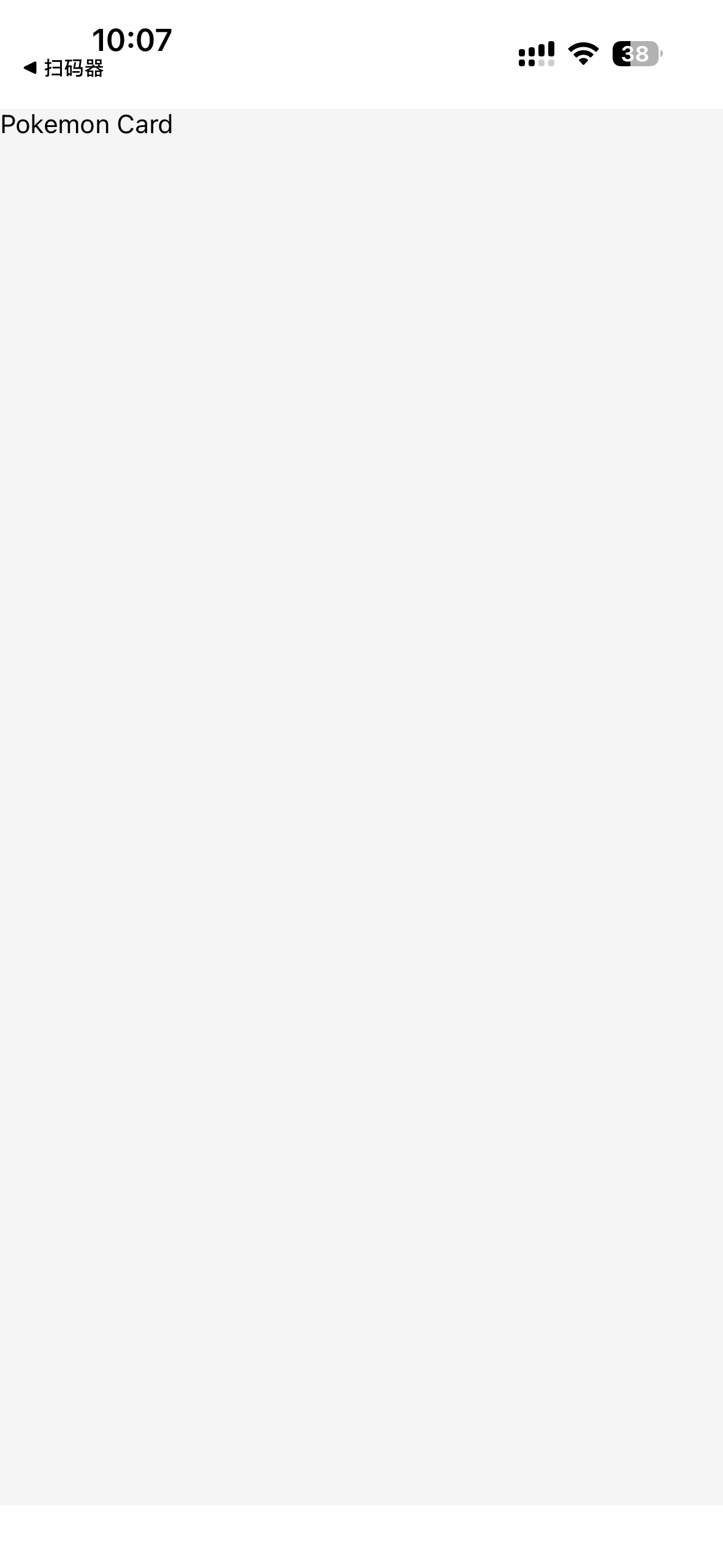
xxxxxxxxxx111// ExerciseOne\components\PokemonCard.tsx23import { Text, View } from "react-native";45export default function PokemonCard() {6 return (7 <View>8 <Text>Pokemon Card</Text>9 </View>10 );11}5、引入组件
xxxxxxxxxx191// app/index.tsx23import PokemonCard from "@/components/PokemonCard";4import { StyleSheet, View } from "react-native";56export default function Index() {7 return (8 <View style={styles.container}>9 <PokemonCard />10 </View>11 );12}1314const styles = StyleSheet.create({15 container: {16 flex: 1,17 backgroundColor: "#f5f5f5",18 },19});效果:
46 - Build a Pokemon Card (2/6)
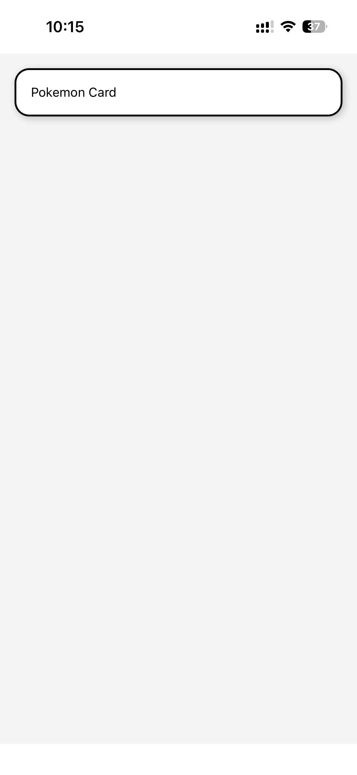
编辑Card组件的样式:
xxxxxxxxxx351// ExerciseOne\components\PokemonCard.tsx23import { Text, View, StyleSheet, Platform } from "react-native";45export default function PokemonCard() {6 return (7 <View style={styles.card}>8 <Text>Pokemon Card</Text>9 </View>10 );11}1213const styles = StyleSheet.create({14 card: {15 backgroundColor: "white",16 borderRadius: 16,17 borderWidth: 2,18 padding: 16,19 margin: 16,20 Platform.select({21 ios: {22 shadowColor: "#333",23 shadowOpacity: 0.3,24 shadowRadius: 4,25 shadowOffset: {26 width: 2,27 height: 2,28 },29 },30 android: {31 elevation: 5,32 },33 }),34 },35});效果:
47 - Build a Pokemon Card (3/6)
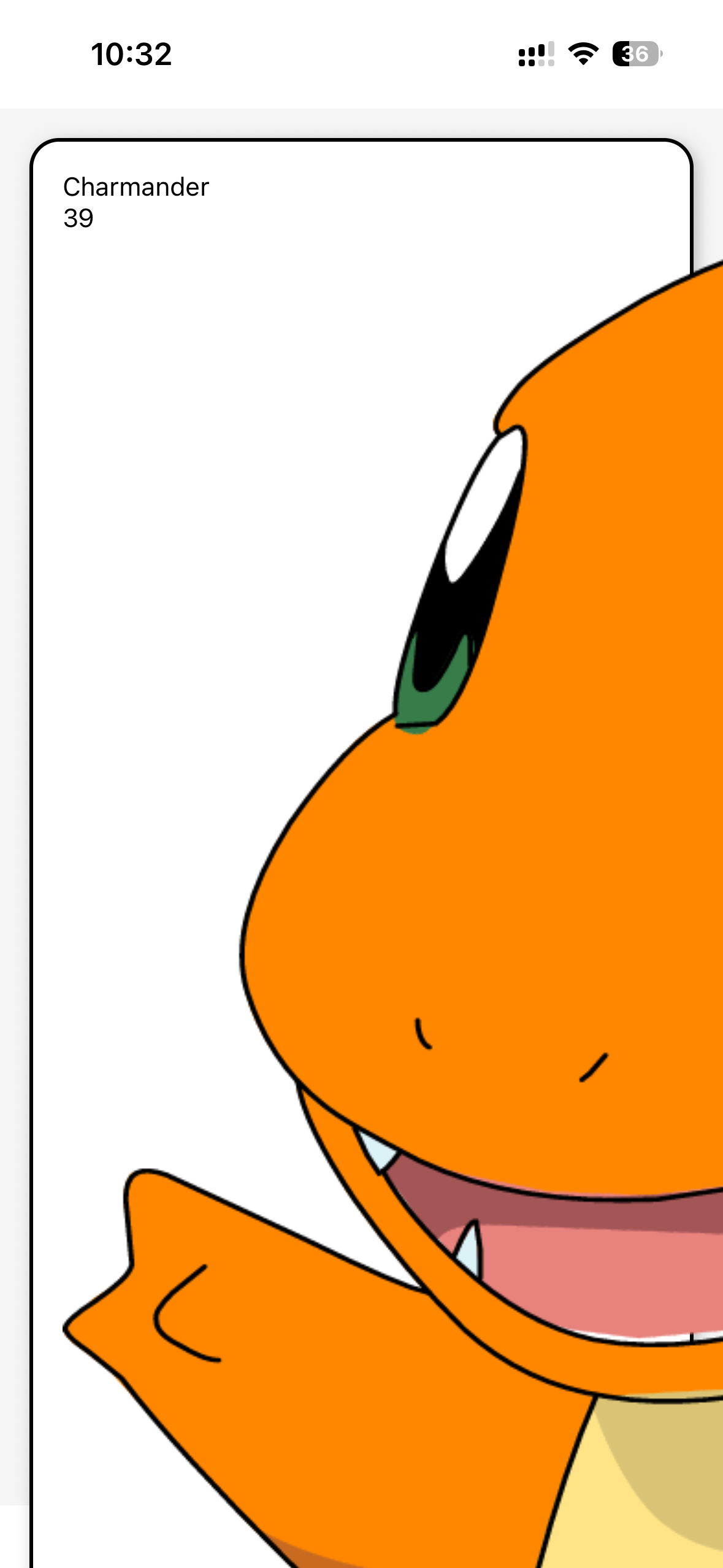
将传递过来的props显示到Card组件上:
xxxxxxxxxx271// app/index.tsx23import PokemonCard from "@/components/PokemonCard";4import { StyleSheet, View } from "react-native";56export default function Index() {7 const charmanderData = {8 name: "Charmander",9 image: require("../assets/charmander.png"),10 type: "Fire",11 hp: 39,12 moves: ["Scratch", "Ember", "Growl", "Leer"],13 weaknesses: ["Water", "Rock"],14 };15 return (16 <View style={styles.container}>17 <PokemonCard {charmanderData} />18 </View>19 );20}2122const styles = StyleSheet.create({23 container: {24 flex: 1,25 backgroundColor: "#f5f5f5",26 },27});xxxxxxxxxx431// ExerciseOne\components\PokemonCard.tsx23import { Text, View, StyleSheet, Platform, Image } from "react-native";45type CardProps = {6 name: string;7 image: number; // React Native require() 导入的本地图片是一个数字(引用ID)8 type: string;9 hp: number;10 moves: string[];11 weaknesses: string[];12};1314export default function PokemonCard({ name, image, type, hp, moves, weaknesses }: CardProps) {15 return (16 <View style={styles.card}>17 <View>18 <Text>{name}</Text>19 <Text>{hp}</Text>20 </View>2122 <Image source={image} accessibilityLabel={`${name} pokemon`} />2324 <View>25 <Text>{type}</Text>26 </View>2728 <View>29 <Text>Moves: {moves.join(", ")}</Text>30 </View>3132 <View>33 <Text>Weakness: {weaknesses.join(", ")}</Text>34 </View>35 </View>36 );37}3839const styles = StyleSheet.create({40 card: {41 42 },43});效果:
48 - Build a Pokemon Card (4/6)
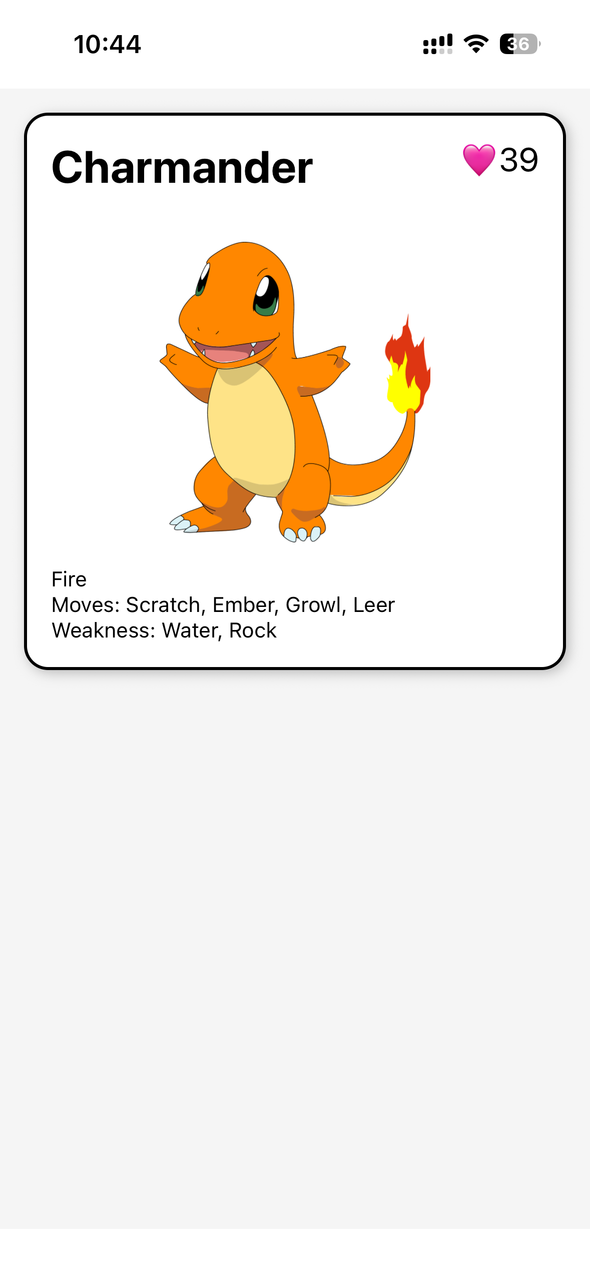
编辑Card里面内容的样式:
xxxxxxxxxx831// ExerciseOne\components\PokemonCard.tsx23import { Text, View, StyleSheet, Platform, Image } from "react-native";45type CardProps = {6 name: string;7 image: number; // React Native require() 导入的本地图片是一个数字(引用ID)8 type: string;9 hp: number;10 moves: string[];11 weaknesses: string[];12};1314export default function PokemonCard({ name, image, type, hp, moves, weaknesses }: CardProps) {15 return (16 <View style={styles.card}>17 <View style={styles.nameContainer}>18 <Text style={styles.name}>{name}</Text>19 <Text style={styles.hp}>🩷{hp}</Text>20 </View>2122 <Image23 source={image}24 style={styles.image}25 resizeMode="contain"26 accessibilityLabel={`${name} pokemon`}27 />2829 <View>30 <Text>{type}</Text>31 </View>3233 <View>34 <Text>Moves: {moves.join(", ")}</Text>35 </View>3637 <View>38 <Text>Weakness: {weaknesses.join(", ")}</Text>39 </View>40 </View>41 );42}4344const styles = StyleSheet.create({45 card: {46 backgroundColor: "white",47 borderRadius: 16,48 borderWidth: 2,49 padding: 16,50 margin: 16,51 Platform.select({52 ios: {53 shadowColor: "#333",54 shadowOpacity: 0.3,55 shadowRadius: 4,56 shadowOffset: {57 width: 2,58 height: 2,59 },60 },61 android: {62 elevation: 5,63 },64 }),65 },66 nameContainer: {67 flexDirection: "row",68 justifyContent: "space-between",69 marginBottom: 32,70 },71 name: {72 fontSize: 30,73 fontWeight: "bold",74 },75 hp: {76 fontSize: 22,77 },78 image: {79 width: "100%",80 height: 200,81 marginBottom: 16,82 },83});效果:
49 - Build a Pokemon Card (5/6)
继续编辑Card里面内容的样式,主要是type、moves、weakness相关的样式:
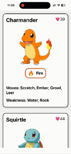
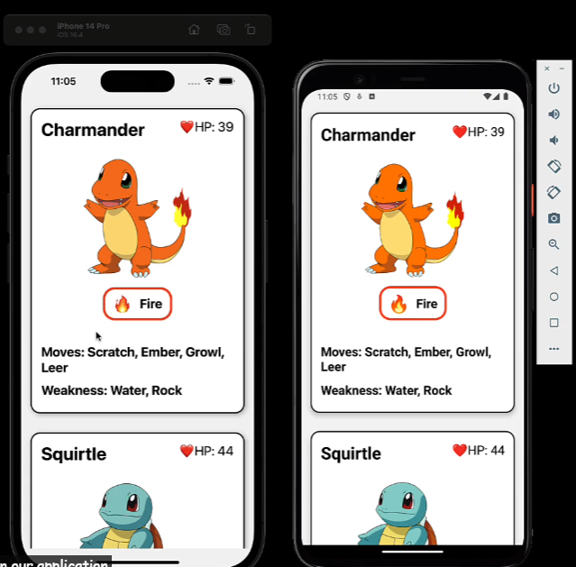
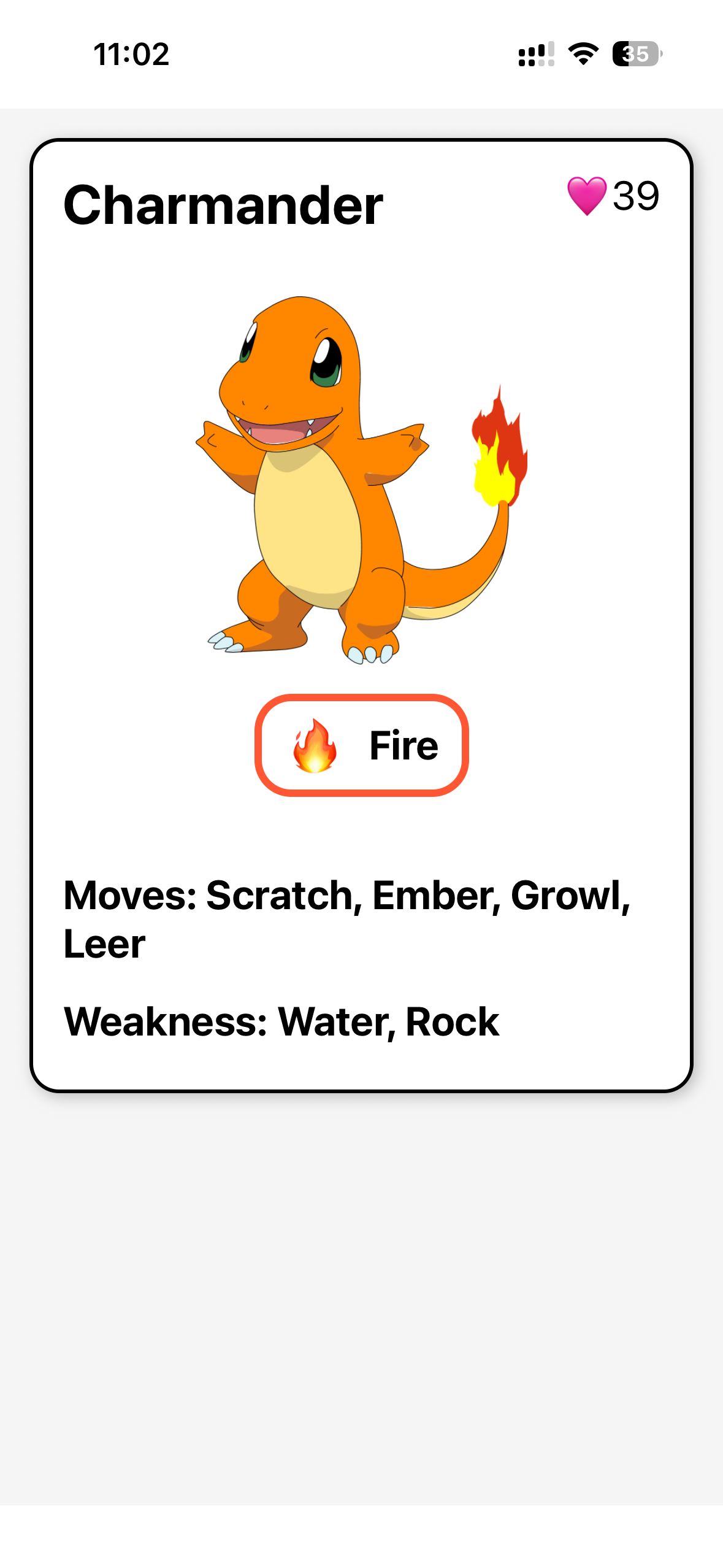
xxxxxxxxxx1361// ExerciseOne\components\PokemonCard.tsx23import { Text, View, StyleSheet, Platform, Image } from "react-native";45const getTypeDetails = (type) => {6 switch (type.toLowerCase()) {7 case "electric":8 return { borderColor: "#FFD700", emoji: "⚡️" };9 case "water":10 return { borderColor: "#6493EA", emoji: "💧" };11 case "fire":12 return { borderColor: "#FF5733", emoji: "🔥" };13 case "grass":14 return { borderColor: "#66CC66", emoji: "🌿" };15 default:16 return { borderColor: "#A0A0A0", emoji: "❓" };17 }18};1920type CardProps = {21 name: string;22 image: number; // React Native require() 导入的本地图片是一个数字(引用ID)23 type: string;24 hp: number;25 moves: string[];26 weaknesses: string[];27};2829export default function PokemonCard({ name, image, type, hp, moves, weaknesses }: CardProps) {30 const { borderColor, emoji } = getTypeDetails(type);31 return (32 <View style={styles.card}>33 <View style={styles.nameContainer}>34 <Text style={styles.name}>{name}</Text>35 <Text style={styles.hp}>🩷{hp}</Text>36 </View>3738 <Image39 source={image}40 style={styles.image}41 resizeMode="contain"42 accessibilityLabel={`${name} pokemon`}43 />4445 <View style={styles.typeContainer}>46 <View style={[styles.badge, { borderColor }]}>47 <Text style={styles.typeEmoji}>{emoji}</Text>48 <Text style={styles.typeText}>{type}</Text>49 </View>50 </View>5152 <View style={styles.movesContainer}>53 <Text style={styles.movesText}>Moves: {moves.join(", ")}</Text>54 </View>5556 <View style={styles.weaknessContainer}>57 <Text style={styles.weaknessText}>Weakness: {weaknesses.join(", ")}</Text>58 </View>59 </View>60 );61}6263const styles = StyleSheet.create({64 card: {65 backgroundColor: "white",66 borderRadius: 16,67 borderWidth: 2,68 padding: 16,69 margin: 16,70 Platform.select({71 ios: {72 shadowColor: "#333",73 shadowOpacity: 0.3,74 shadowRadius: 4,75 shadowOffset: {76 width: 2,77 height: 2,78 },79 },80 android: {81 elevation: 5,82 },83 }),84 },85 nameContainer: {86 flexDirection: "row",87 justifyContent: "space-between",88 marginBottom: 32,89 },90 name: {91 fontSize: 30,92 fontWeight: "bold",93 },94 hp: {95 fontSize: 22,96 },97 image: {98 width: "100%",99 height: 200,100 marginBottom: 16,101 },102 typeContainer: {103 alignItems: "center",104 marginBottom: 40,105 },106 badge: {107 flexDirection: "row",108 alignItems: "center",109 paddingVertical: 6,110 paddingHorizontal: 12,111 borderRadius: 20,112 borderWidth: 4,113 },114 typeEmoji: {115 fontSize: 30,116 marginRight: 12,117 },118 typeText: {119 fontSize: 22,120 fontWeight: "bold",121 },122 movesContainer: {123 marginBottom: 16,124 },125 movesText: {126 fontSize: 22,127 fontWeight: "bold",128 },129 weaknessContainer: {130 marginBottom: 8,131 },132 weaknessText: {133 fontSize: 22,134 fontWeight: "bold",135 },136});效果:
50 - Build a Pokemon Card (6/6)
Card组件已经做好了,接下来就是渲染多个组件了。要使用ScrollView组件。
xxxxxxxxxx591// app/index.tsx23import PokemonCard from "@/components/PokemonCard";4import { StyleSheet, View, ScrollView } from "react-native";56export default function Index() {7 const charmanderData = {8 name: "Charmander",9 image: require("../assets/charmander.png"),10 type: "Fire",11 hp: 39,12 moves: ["Scratch", "Ember", "Growl", "Leer"],13 weaknesses: ["Water", "Rock"],14 };1516 const squirtleData = {17 name: "Squirtle",18 image: require("../assets/squirtle.png"), // Replace with the actual image path19 type: "Water",20 hp: 44,21 moves: ["Tackle", "Water Gun", "Tail Whip", "Withdraw"],22 weaknesses: ["Electric", "Grass"],23 };2425 const bulbasaurData = {26 name: "Bulbasaur",27 image: require("../assets/bulbasaur.png"), // Replace with the actual image path28 type: "Grass",29 hp: 45,30 moves: ["Tackle", "Vine Whip", "Growl", "Leech Seed"],31 weaknesses: ["Fire", "Ice", "Flying", "Psychic"],32 };3334 const pikachuData = {35 name: "Pikachu",36 image: require("../assets/pikachu.png"), // Replace with the actual image path37 type: "Electric",38 hp: 35,39 moves: ["Quick Attack", "Thunderbolt", "Tail Whip", "Growl"],40 weaknesses: ["Ground"],41 };42 return (43 <View style={styles.container}>44 <ScrollView>45 <PokemonCard {charmanderData} />46 <PokemonCard {squirtleData} />47 <PokemonCard {bulbasaurData} />48 <PokemonCard {pikachuData} />49 </ScrollView>50 </View>51 );52}5354const styles = StyleSheet.create({55 container: {56 flex: 1,57 backgroundColor: "#f5f5f5",58 },59});效果: